Creating the Profile + Badges
Final UI Design + Icons (2021) ☞ JOZEF KOLACZYK
Problem
Users didn't have anything to do in between a live poll, and lacked incentives to stay. There wasn't a logical place for settings or app information to live, either.
Solution:
Create a personalized profile that has uses a user's poll responses to show insights about themselves, as well as display how similar users answered select polls, and incentize user to engage via gamification.
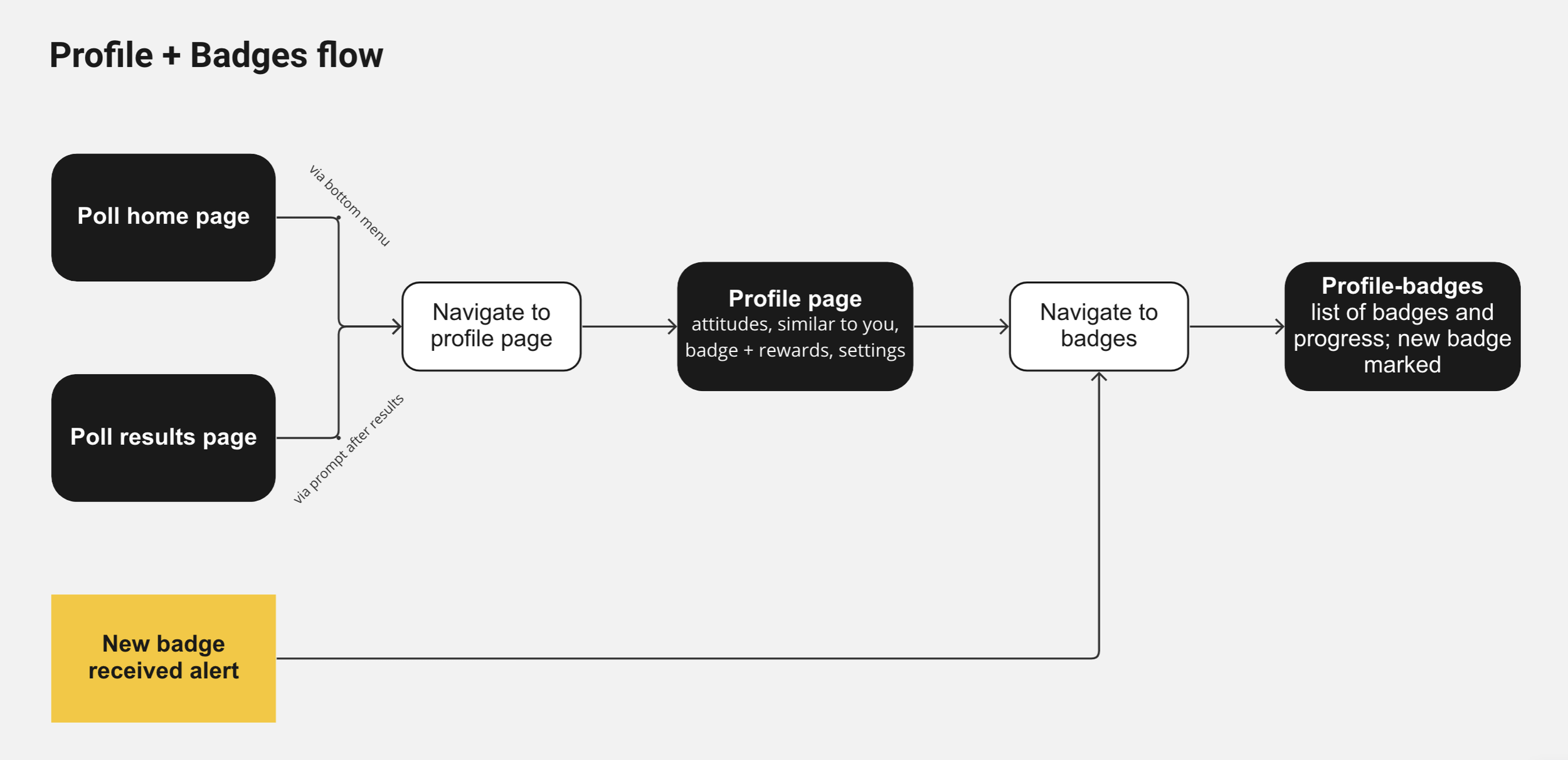
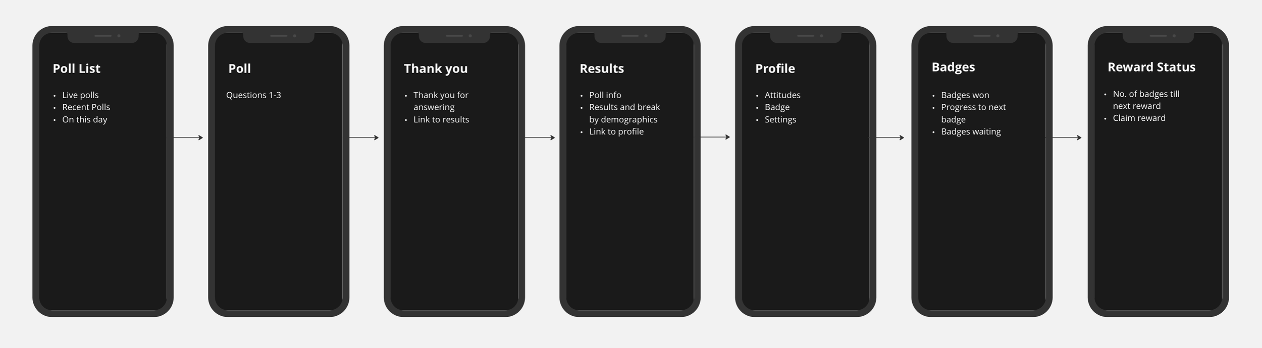
Profile + Checking Badges User Flow
Profile + Settings User Flow
I came up with the concept of a profile and attitudes section, where a user's answers would place them on different demographic spectrums, as well as an "on this day" feature to display past poll results from the calendar date.
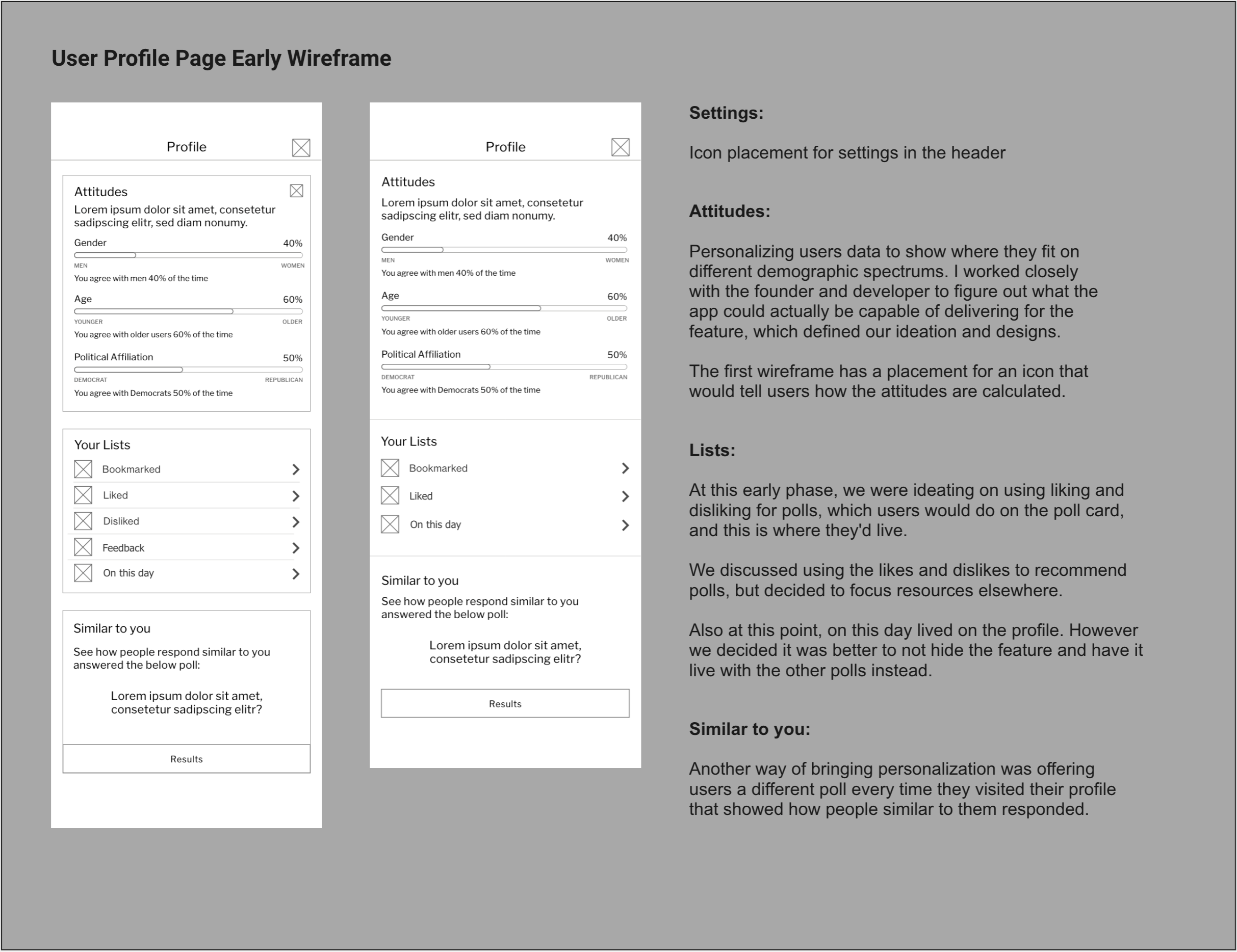
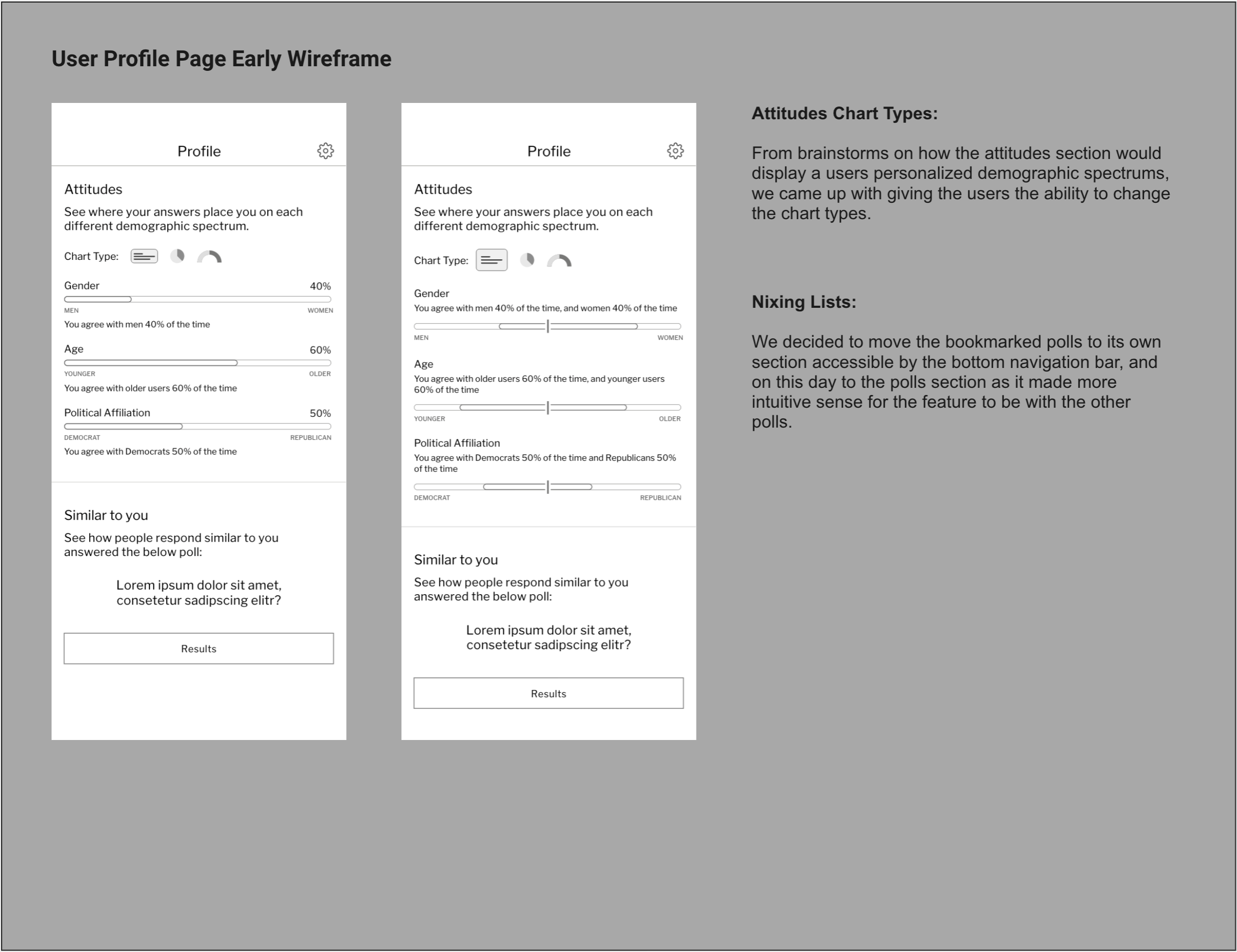
As we didn't want to hide important features like bookmarks and "on this day," we moved bookmarks to its own section on the bottom navigation bar, and the "on this day" feature joined the poll page.
Badges + Rewards
During brainstorming sessions, we had discussed bringing in a gameification strategy, but we wanted to fully flush out the attitudes feature before shifting focus.
However once our team expanded, we were able to bring a gameification strategy to the forefront.
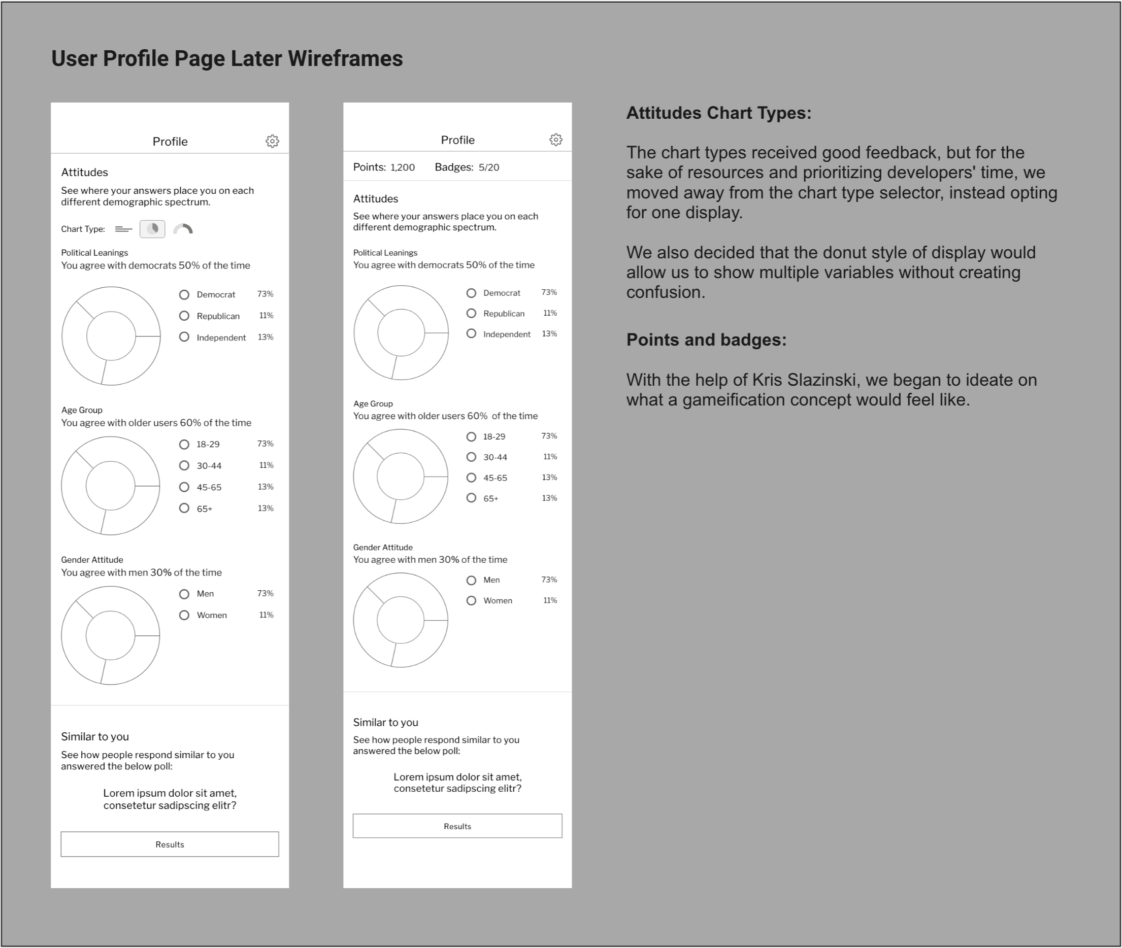

My hi-fidelity profile and settings screens before implementing badges + rewards
A screenshot from a badge brainstorming with badge titles, categories, descriptions, and trigger actions
A screenshot from the excel file with the final list of badges along with their descriptions and triggers.
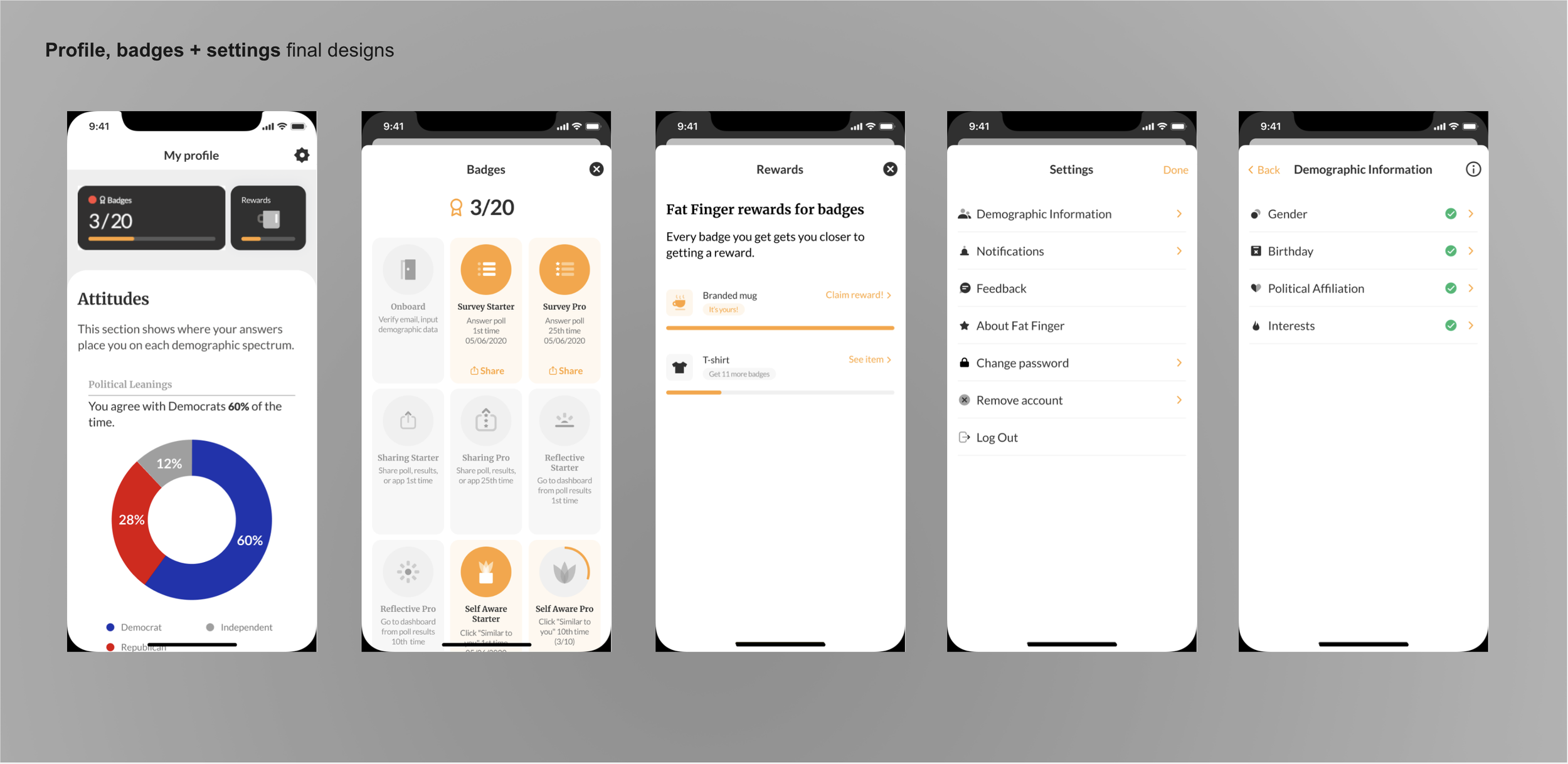
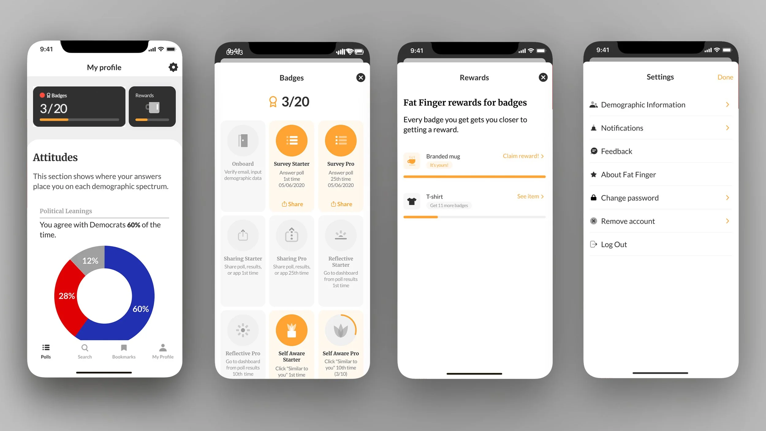
Final screens for the profile, badges + rewards, done in collaboration with Jozef Kołaczyk + Kris
Testing
During hallway testing, most users
passed without problems, however a few
The list of rewards also needed improvement. We decided to write "Claim a reward" instead of "see reward" to make the action clearer to the user, and also make the reward visually standout by highlighting the reward with a different background.
Another idea that came out of testing
was showing the
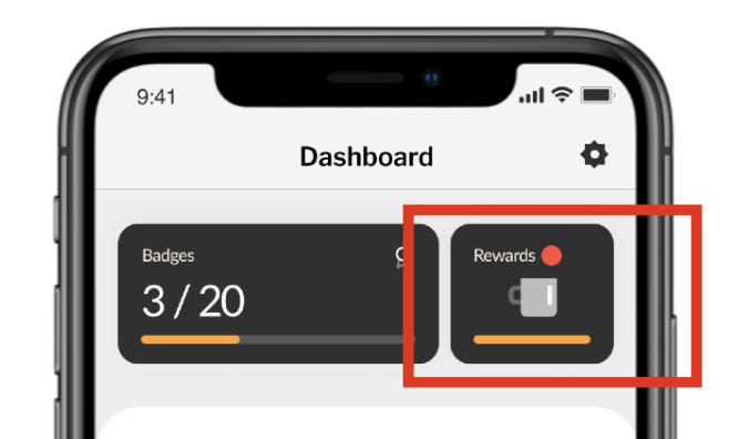
A more prominent indicator that user needs to perform some action
Outcome
Getting Feedback from Users
I worked with the founder to create a survey collecting feedback from users ten days after they became active on the app. We asked about their enjoyment, level of interest, and if they were using some of the new features. We wanted to know what was meaningful to the user, and what wasn’t.
I also analyzed the feedback that came through the feedback portal, as well as through respective store reviews.
The new app achieved our measures of success, with an increase in our active user base, a more diverse audience, and a reduced cost for user acquisition.
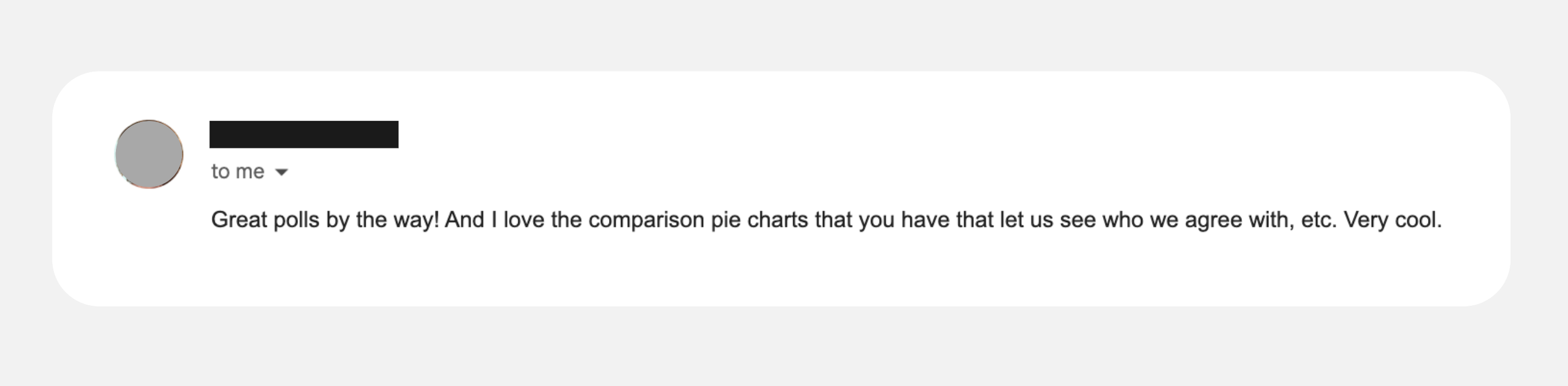
A user wrote us this feedback after the launch of the profile and attitudes section.