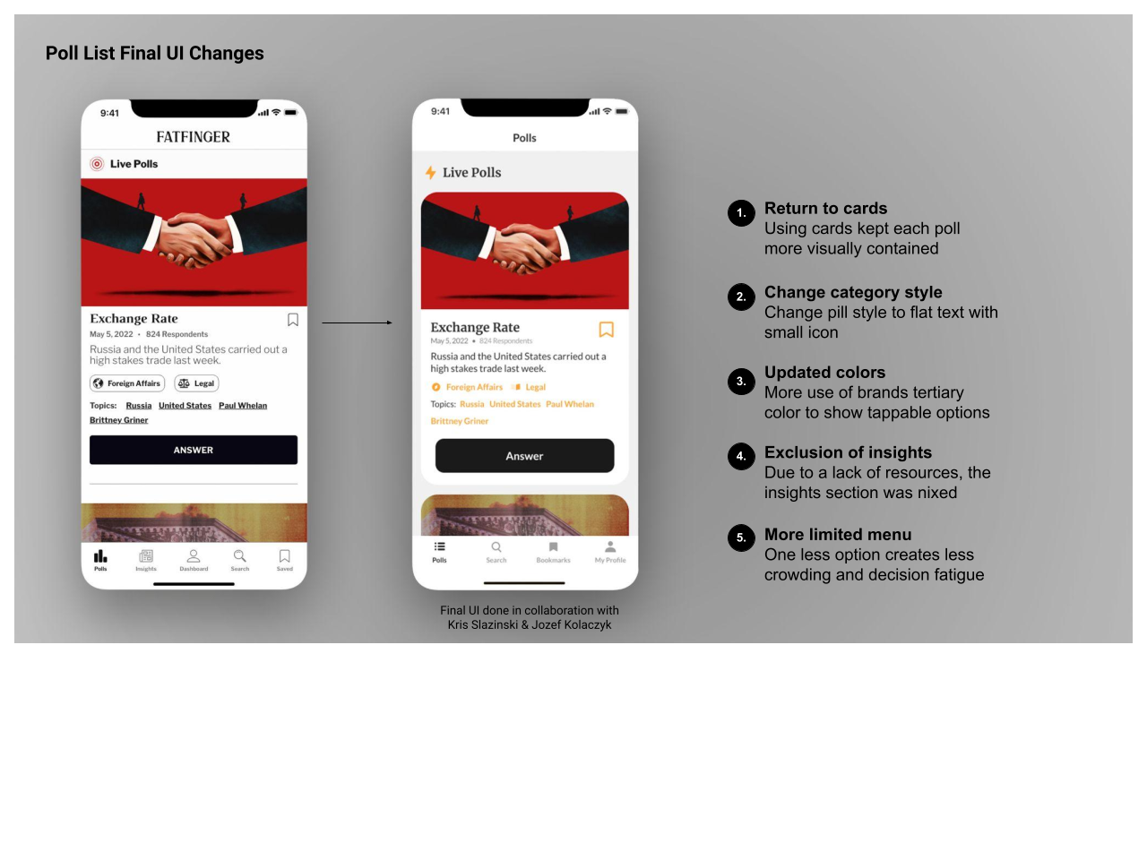
Home Is Where The Polls Are
Final UI Design + Icons (2021) ☞ JOZEF KOLACZYK
Problem:
The original app
Founder Requirements
Solution:
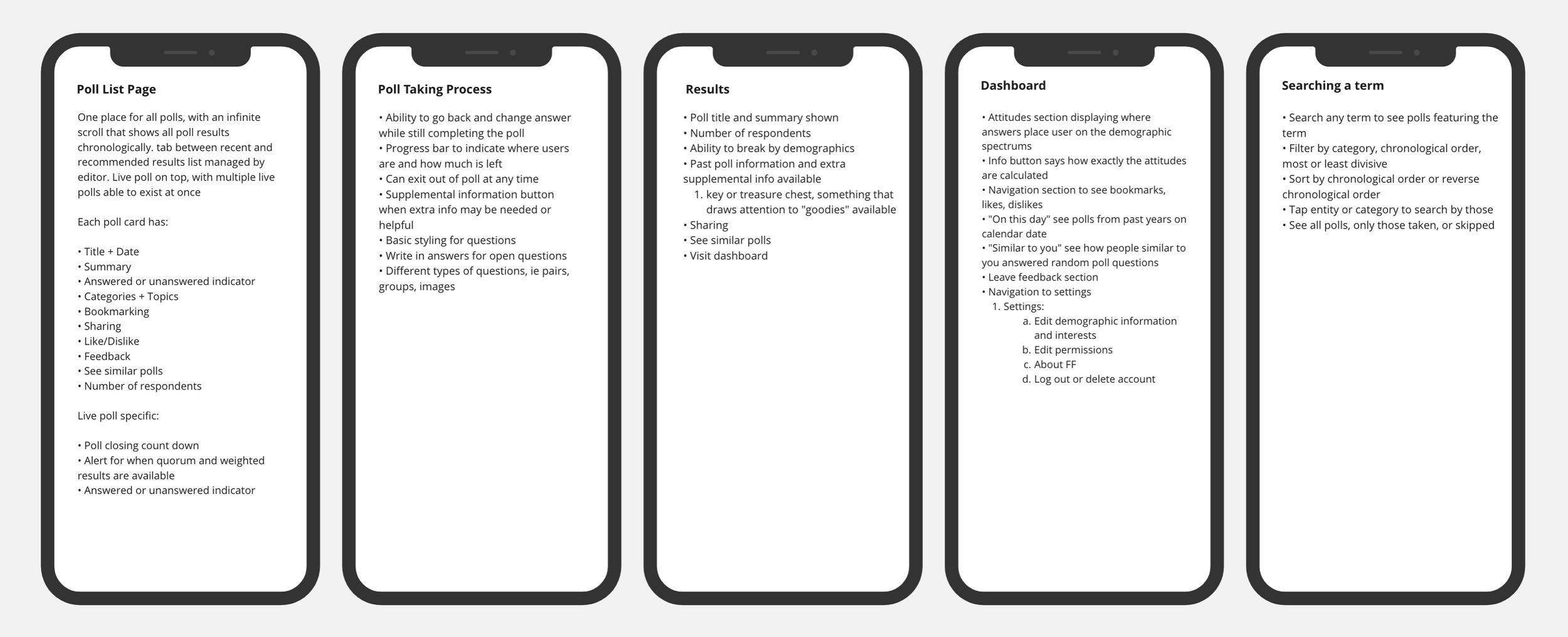
Create a home page for users to land on where they can see new polls and view past results, and give the app an intuitive, navigable structure.
The original app lacked a central hub, and
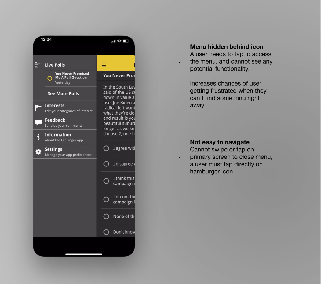
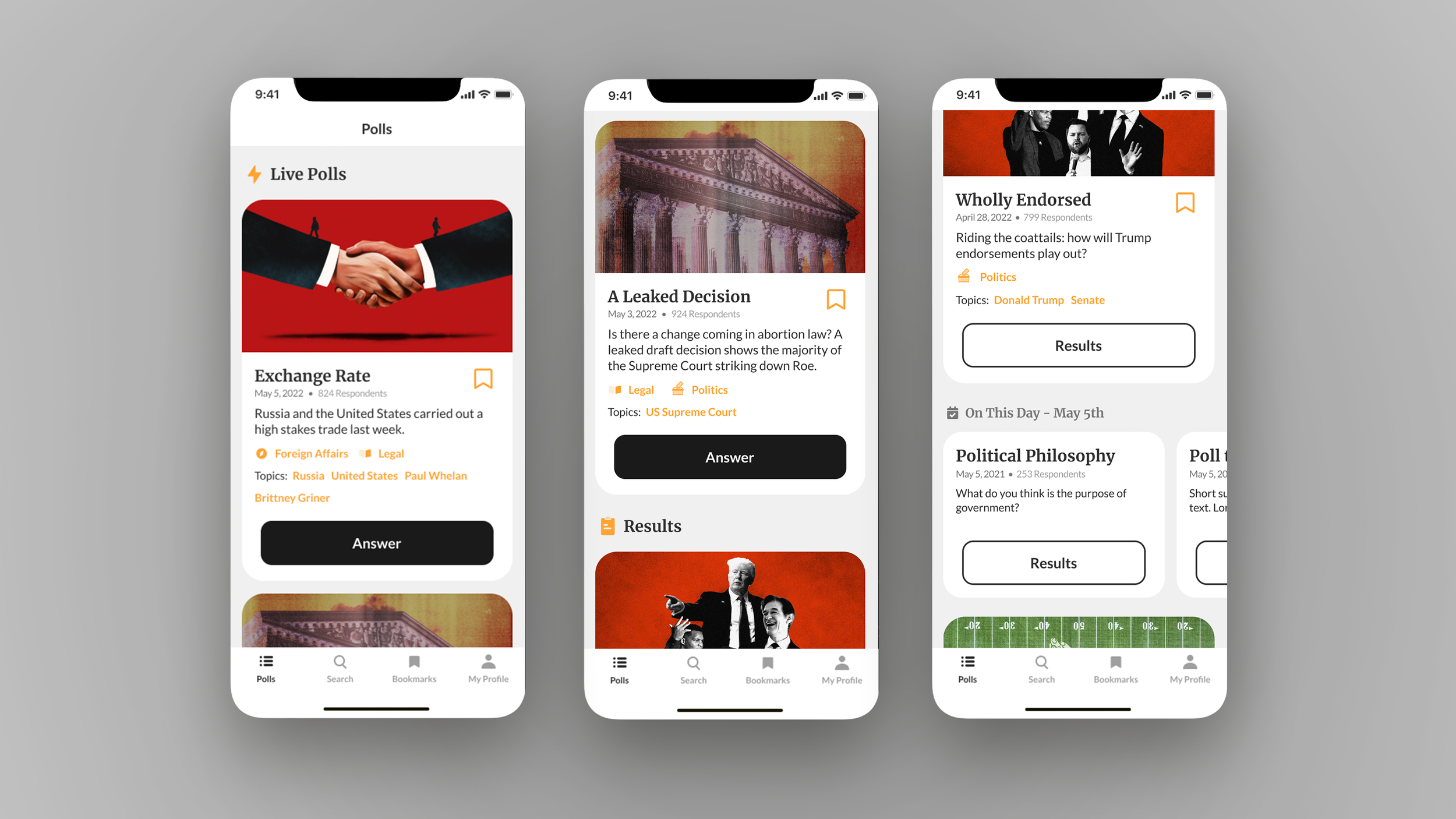
Screenshot from the original app showing the list of polls available, it only has the last ten poll results available to view, and can only have one live poll at a time.
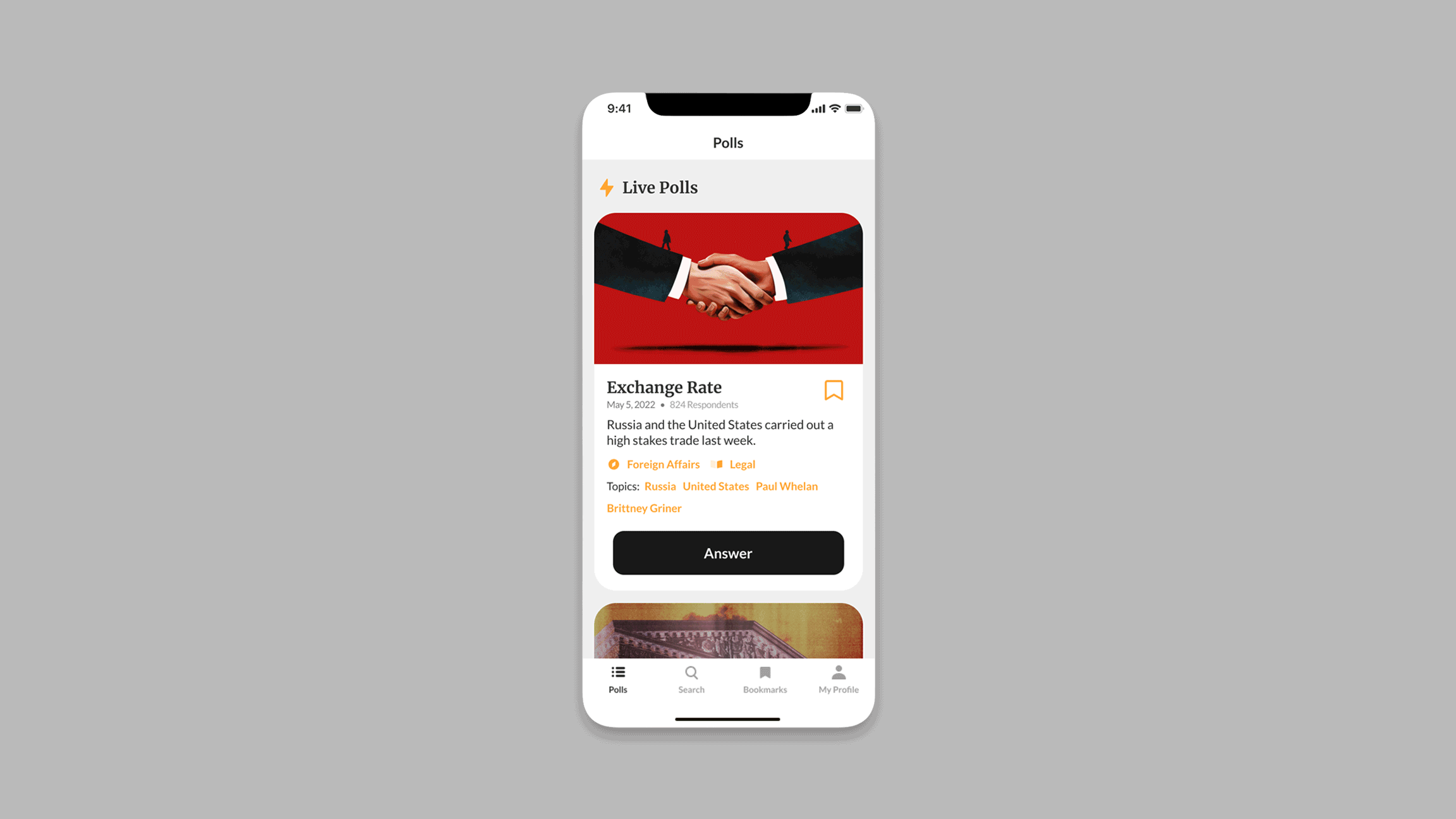
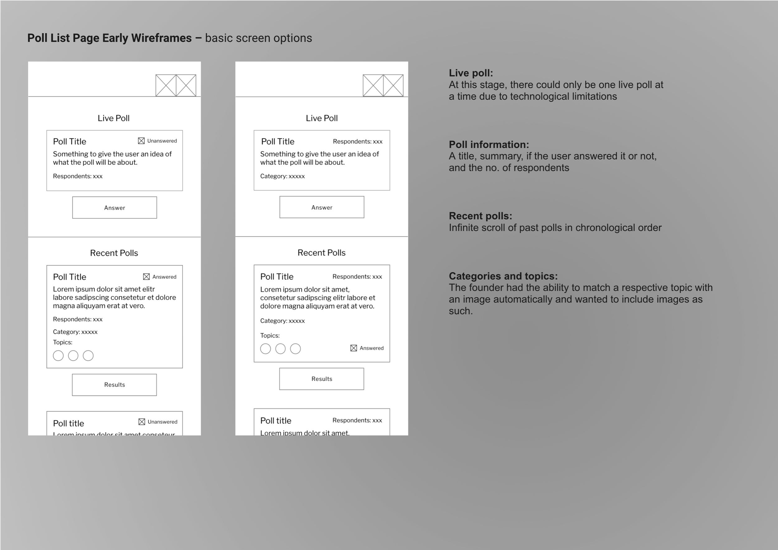
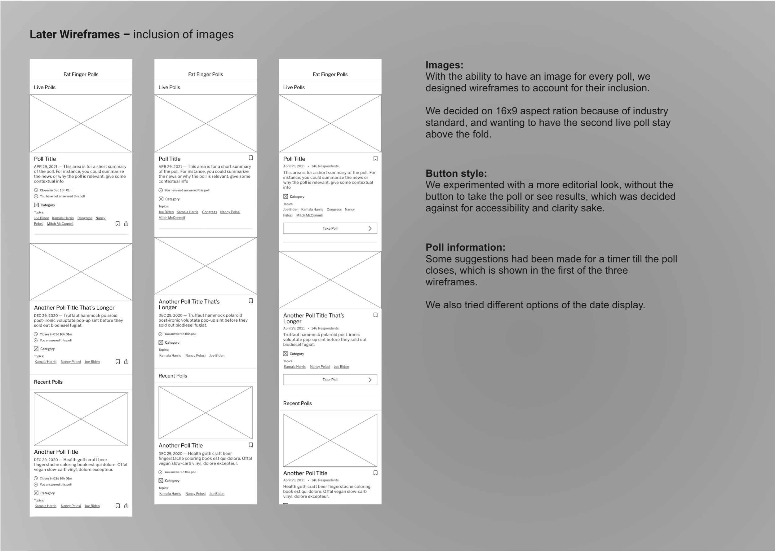
To help users understand the poll topic and set expectations to reduce frustraion, we decided each poll should have a short summary listed with its title.
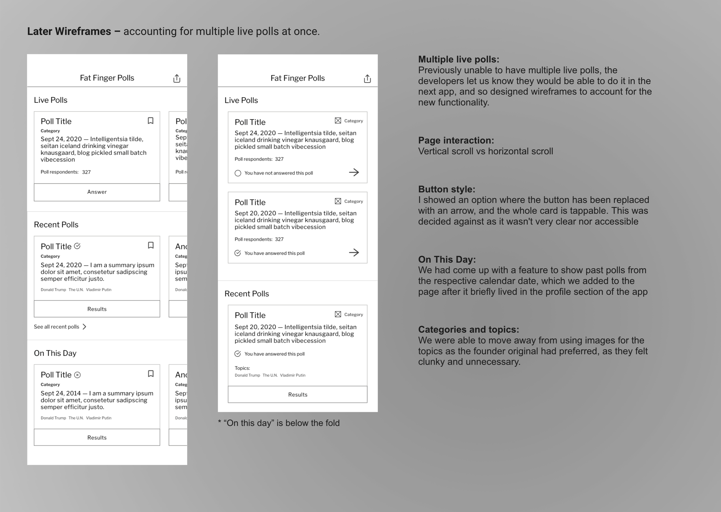
We also decided to implement the use of categories as a new function, acting as both a way to organize the polls as well as giving the user a means to search by a respective category. It was also important to the founder that the polls include specific topics that were more specific than categories.
To create a more whole experience, we wanted to begin including an image with each poll, which, due to limited resources and lack of a content team, was put on the back-burner until later versions.
The poll list page is the app's home page, acting as the jumping off point for all activity in the app.
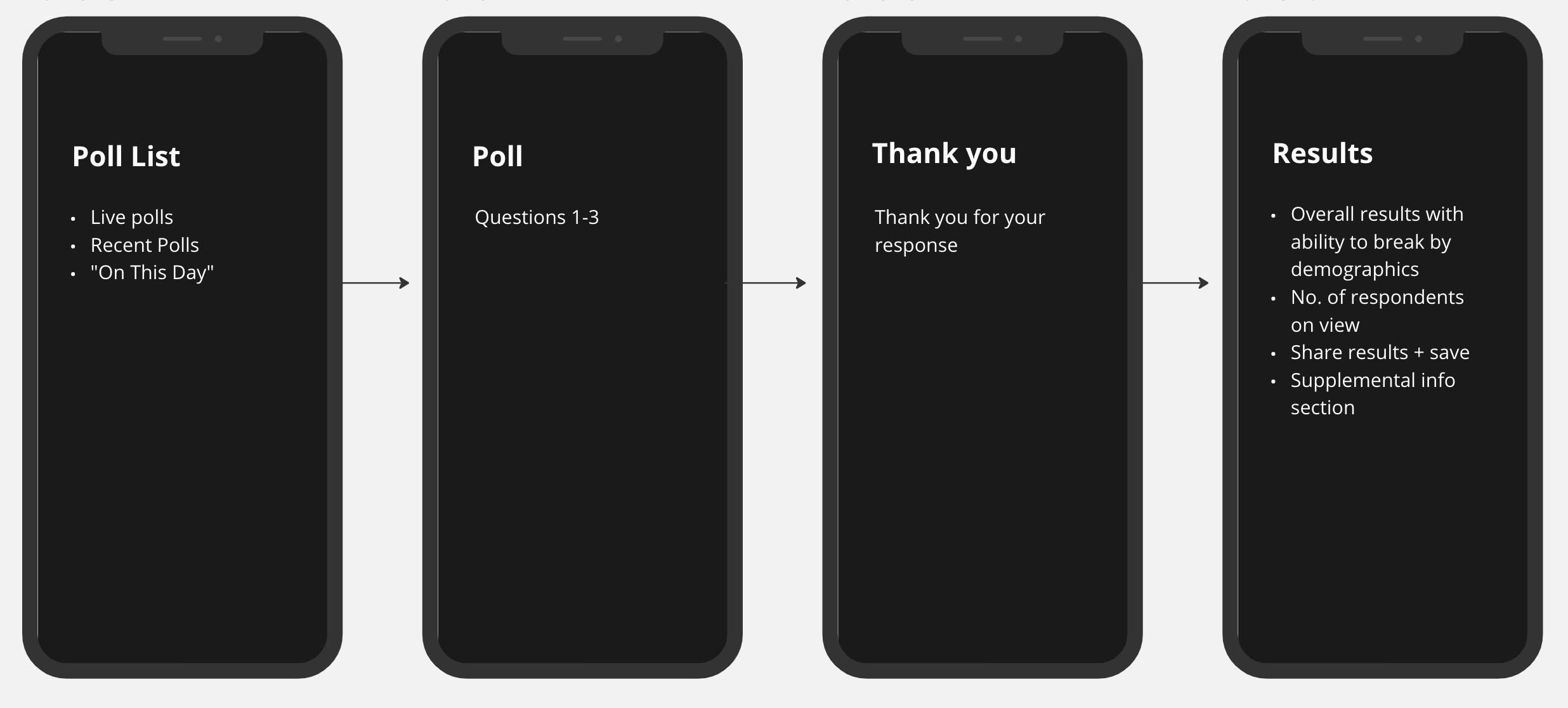
Early brainstorming for information architecture, ideas such as liking and disliking of polls and “see similar polls” are still in play.
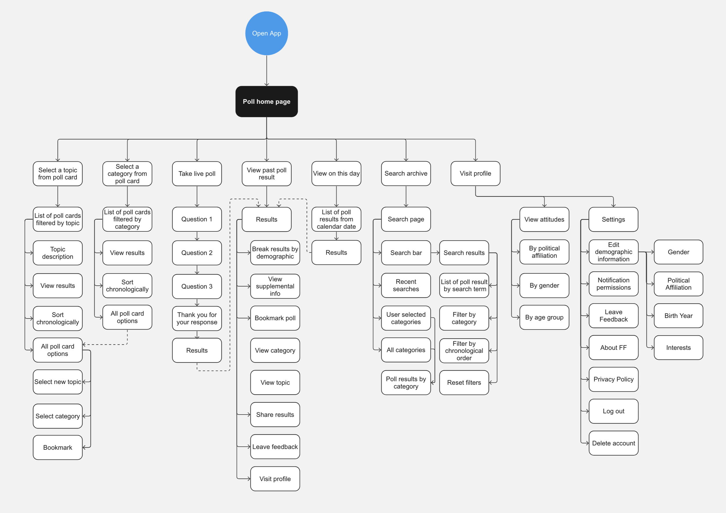
An earlier version of the app’s information architecture I created, before the introduction of badges and rewards.
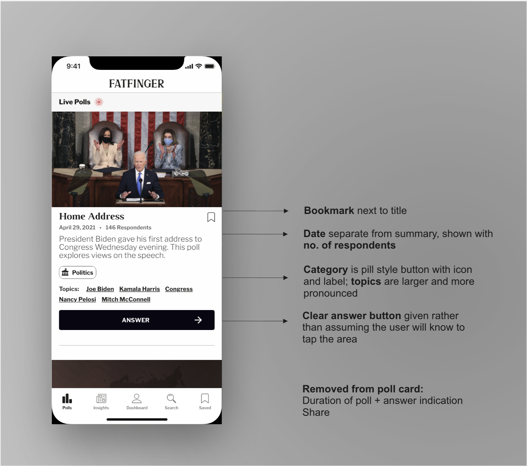
After receiving feedback from
the team and conducting hallway tests, we decided
to use
During iterations, we were able to expand
our content production capabilities and also
subscribed to Getty images, allowing us
to be able to
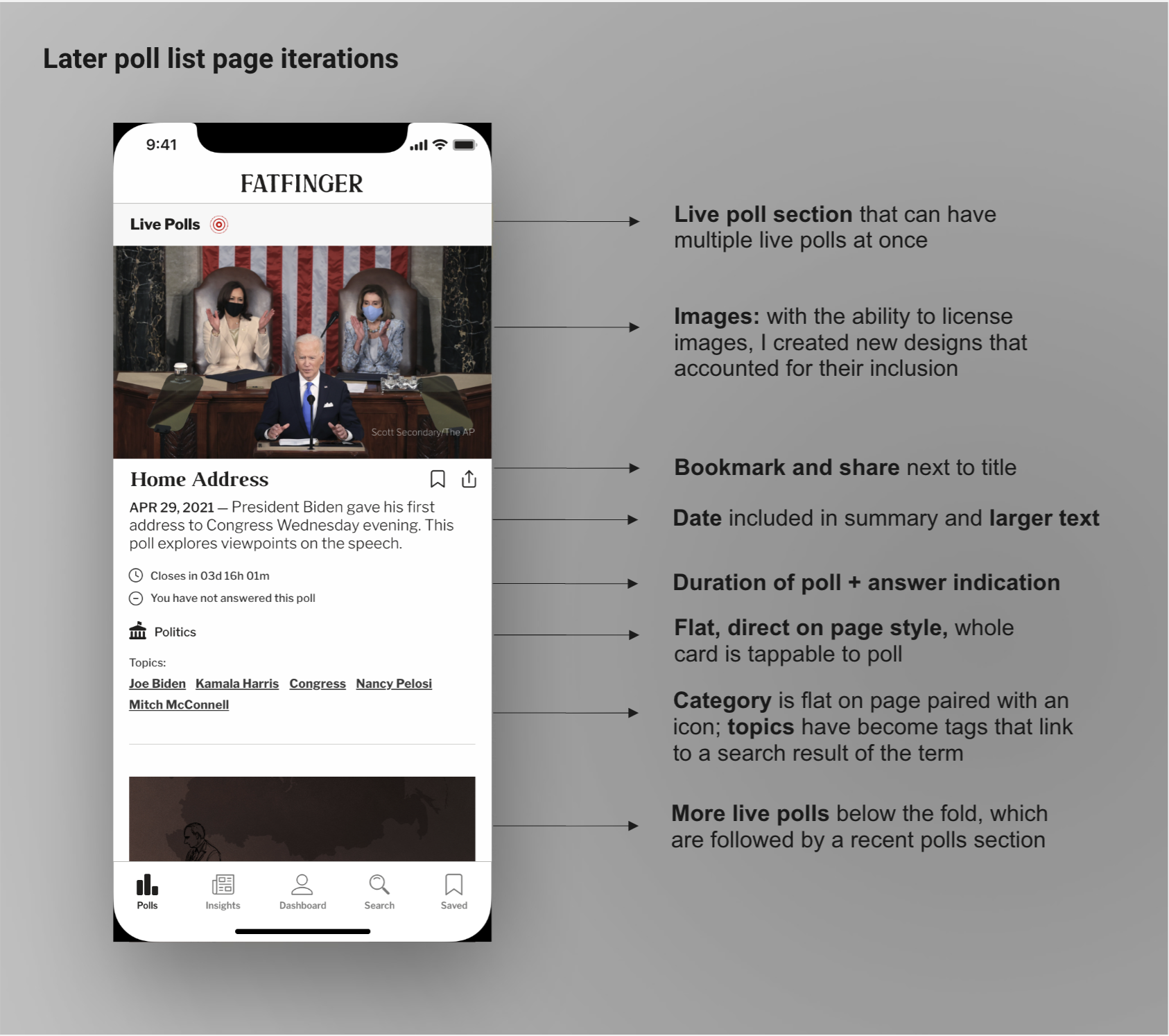
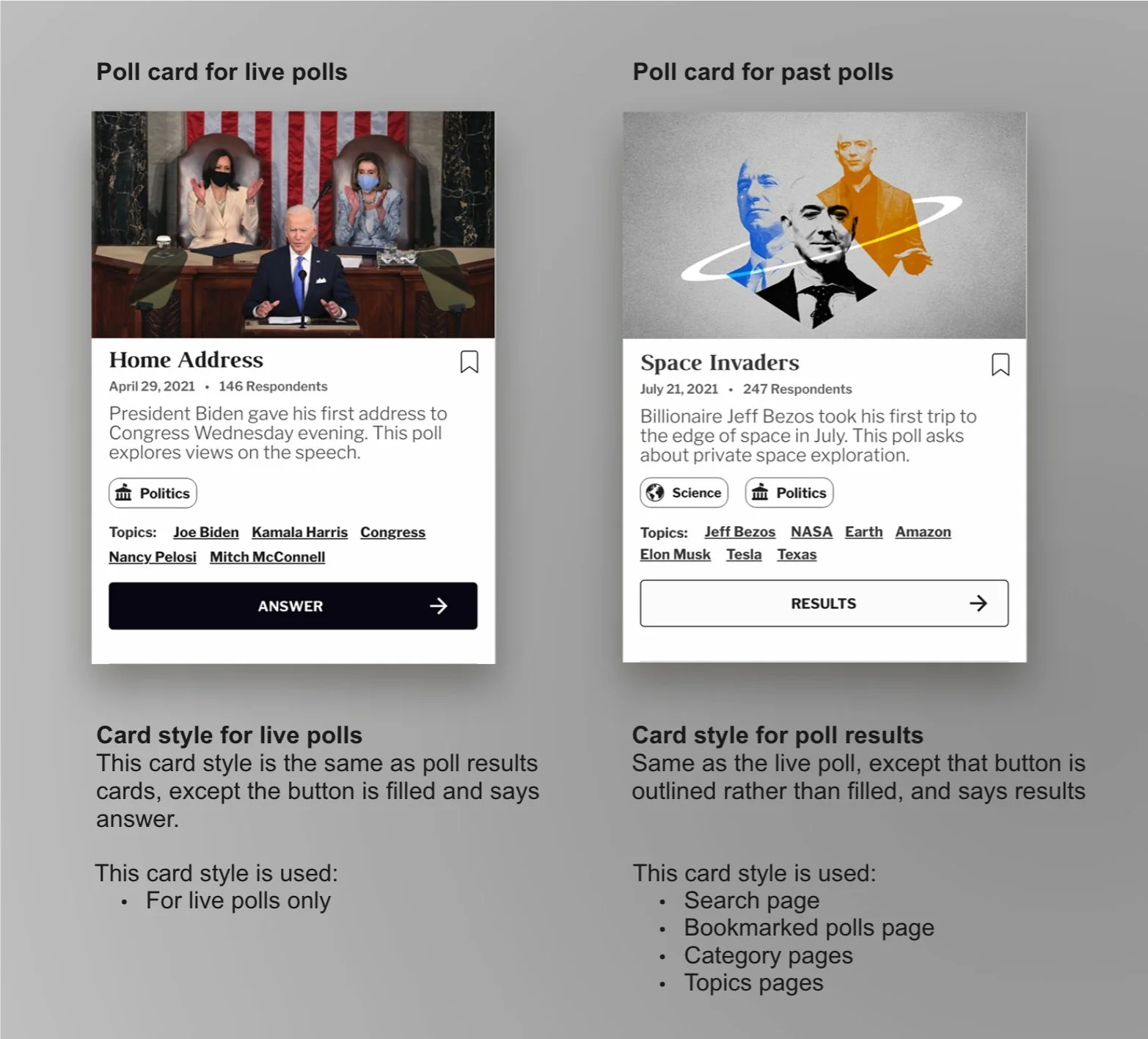
Infinite scroll with poll cards. The live polls are stacked, and past poll results follow in chronological order, only broken by an "On This Day" section that arrives after the first past poll result.