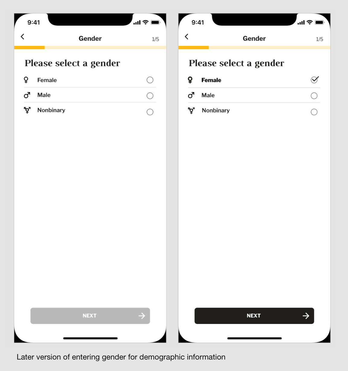
Final UI Design + Icons (2021) ☞ JOZEF KOLACZYK
Problem:
Users get stuck at registration and many drop off, some expressing that the registration is hard to use and they don't have an option to see what the app has to offer before signing up. Also, the entering demographic information stage of registering has no indication of why the information is necessary nor how long it will take. This is another pain point for users.
Solution:
Create an updated registration that allows user to experience app before signing up, provides clear language as to why certain information is needed, and gives informative feedback while they are going through the process
What Exactly is Going On with Onboarding?
The situation was that the app was losing a lot of people during the onboarding process, with a subpar conversion rate from install to active user hovering around 60%.
For context, the onboarding process needed to include a user registration, as well as a process that involved the users entering their demographic information, as this information is necessary for the polls to be accurate.
Onboarding Pain Points
To better understand the user perspective and develop solutions, I conducted user research, reviewing store reviews, user feedback, and analytics, creating empathy maps and personas.
Through my research, I learned that users struggled with completing the onboarding process, getting frustrated and annoyed. They could not see or understand the value in the app and were not sure what it was all about, with a general feeling of distrust surrounding it.
Having built an understanding and empathy for the users' experience with the onboarding process, I conducted a usability review of the app. I examined the experience for usability issues, and found that it had three glaring pain points.
The three main problems involved
Pain Point #1: Users Can't See the Value + Don't Trust the App
Users distrusted the app and weren't able to see its value nor understand its offer before being asked to register and enter the necessary demographic informaiton.
We needed to
To address the opaque value, we first created an introduction screen for users to land on that included feature highlights and mission statement. This is the point where users would then sign up, skip, or log in. I wanted to make sure users were allowed to skip this process for two main reasons of equal weight, the first, in case they weren't comfortable answering a specific part of the demographics section, and the second, so they could experience the app first if they wanted to.
Later we'd cut to the chase,
having a user
To further transparency around the who, what and why,
we gave
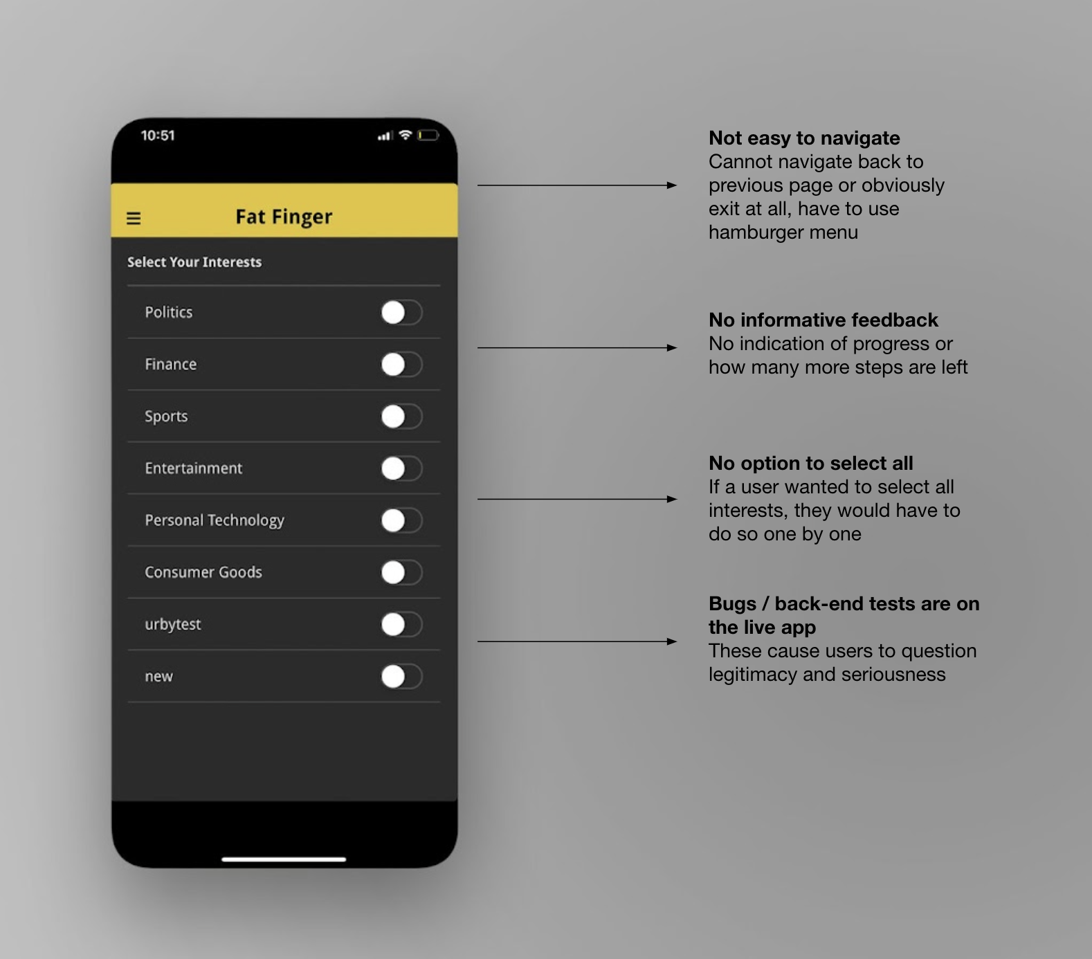
Pain Point #2: No Map, No Directions, No Roadsigns
Users expressed frustration and impatience with the overall onboarding process, and who could blame them?
They had been dropped into the registation process right after install with little information, and are given no signs or signals as to where they are in the process, nor how much more is ahead.
In short, there was
To give users indicators as to their location
and what they could expect and prevent fatigue and frustration while going through the
demographic information process, I gave clear
indicators of where they were in the process with
Also, I came to the conclusion that rather than have
all the questions on one page, I gave
Pain Point #3: No Room for Error
Users had expressed feeling
During the registration and onboarding process,
the
If a user incorrectly entered a piece of information or made the wrong selection, they would have to quit out of the app and start over from the beginning.
Adding
Proposed New User Flow
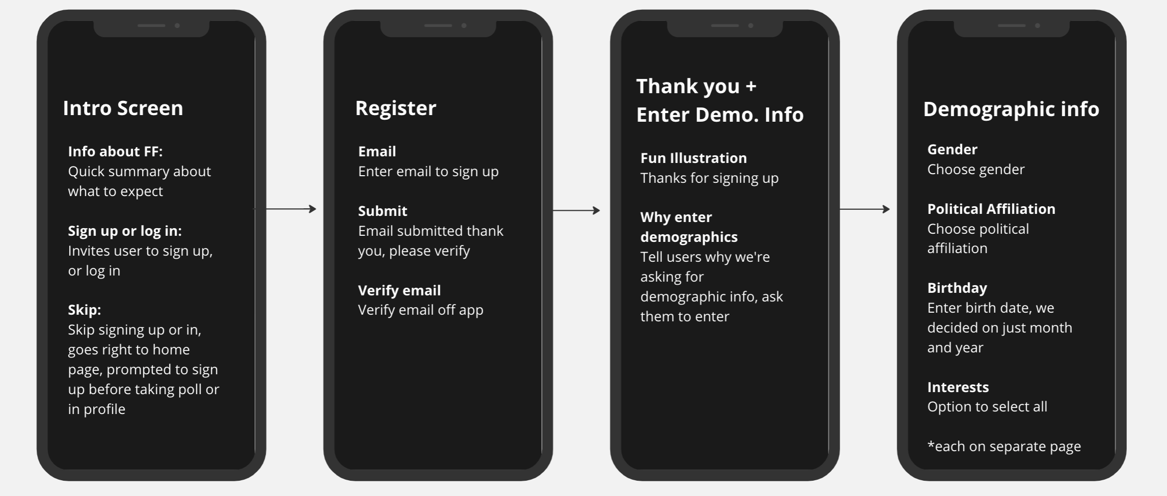
Early Registration + Demographic Information Flow
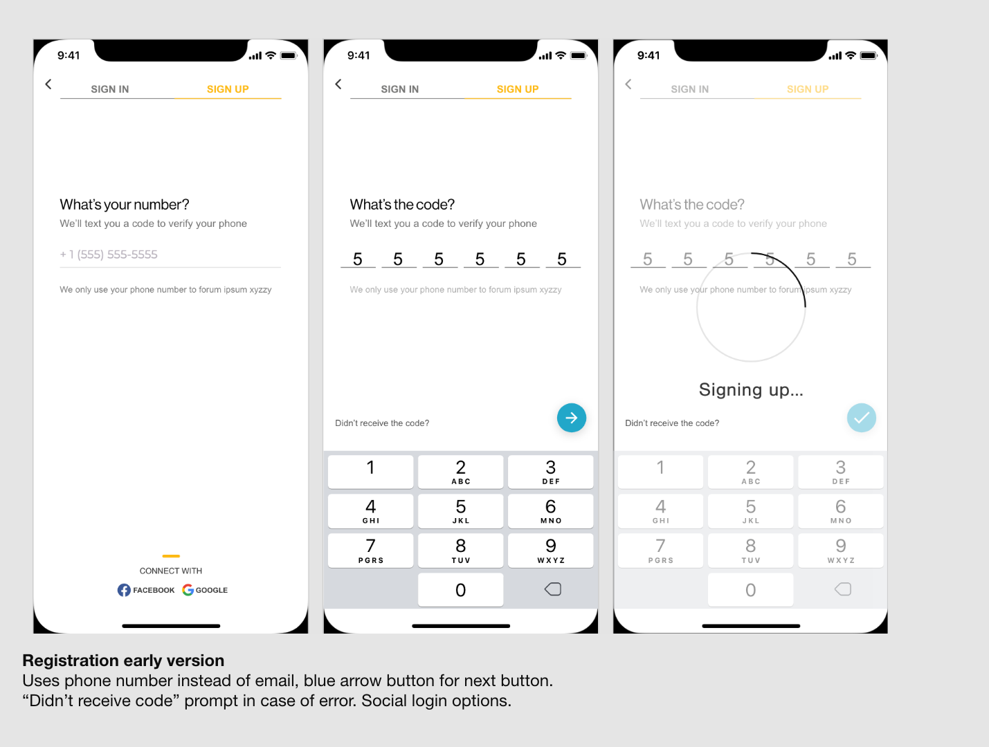
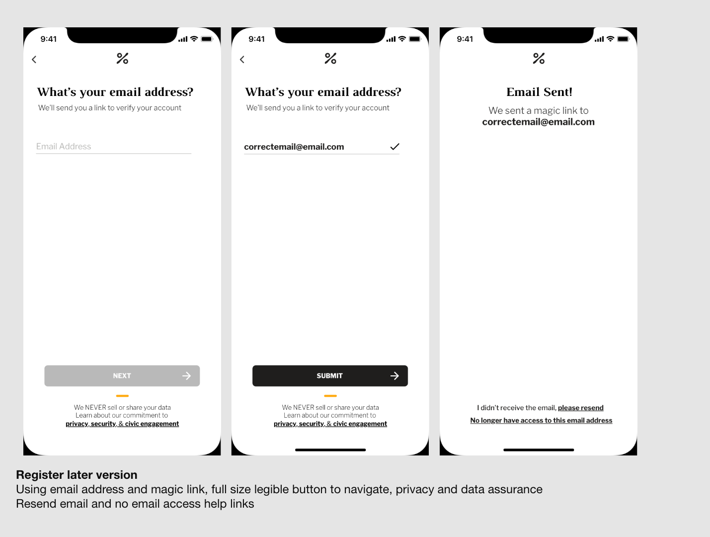
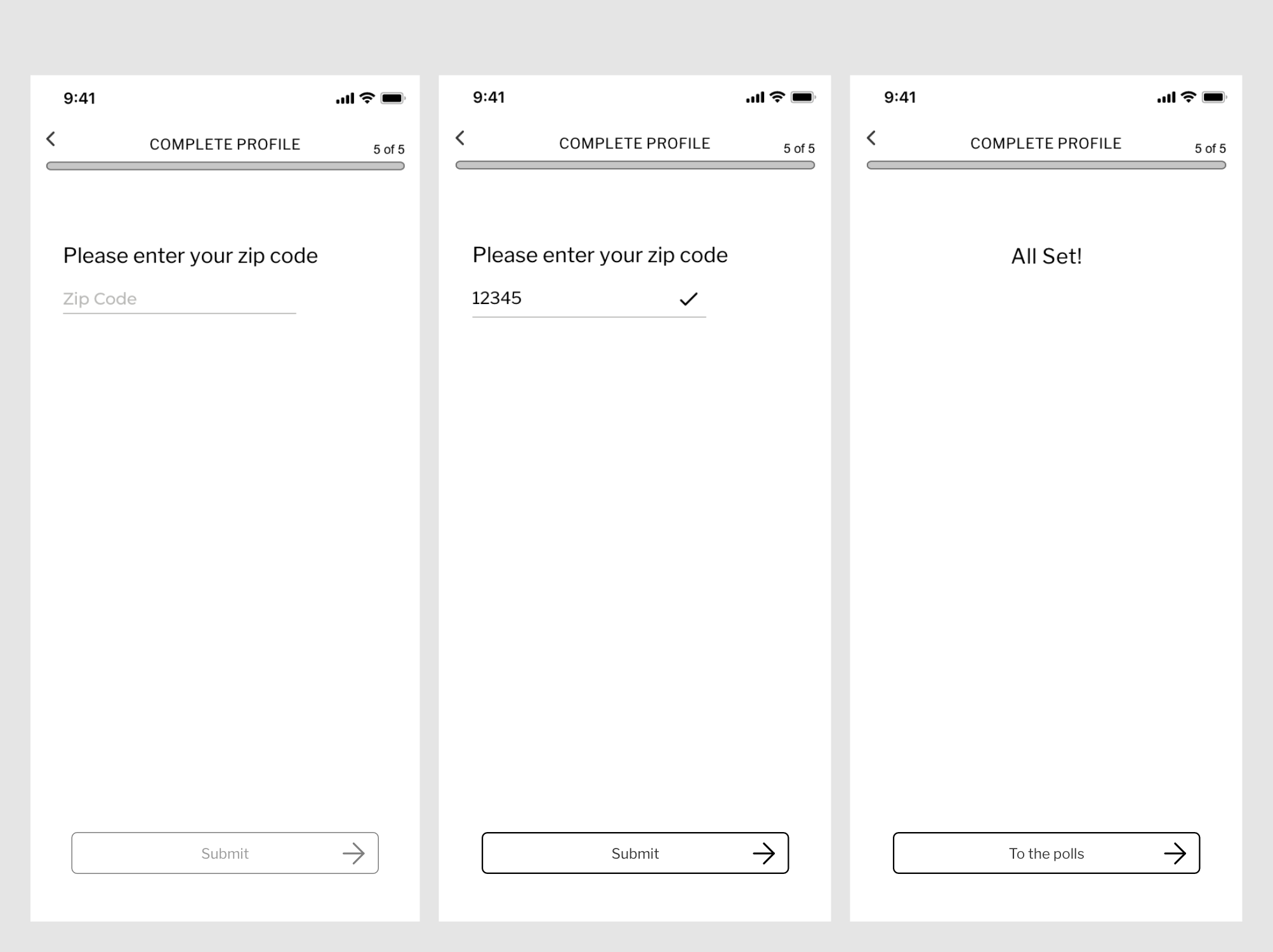
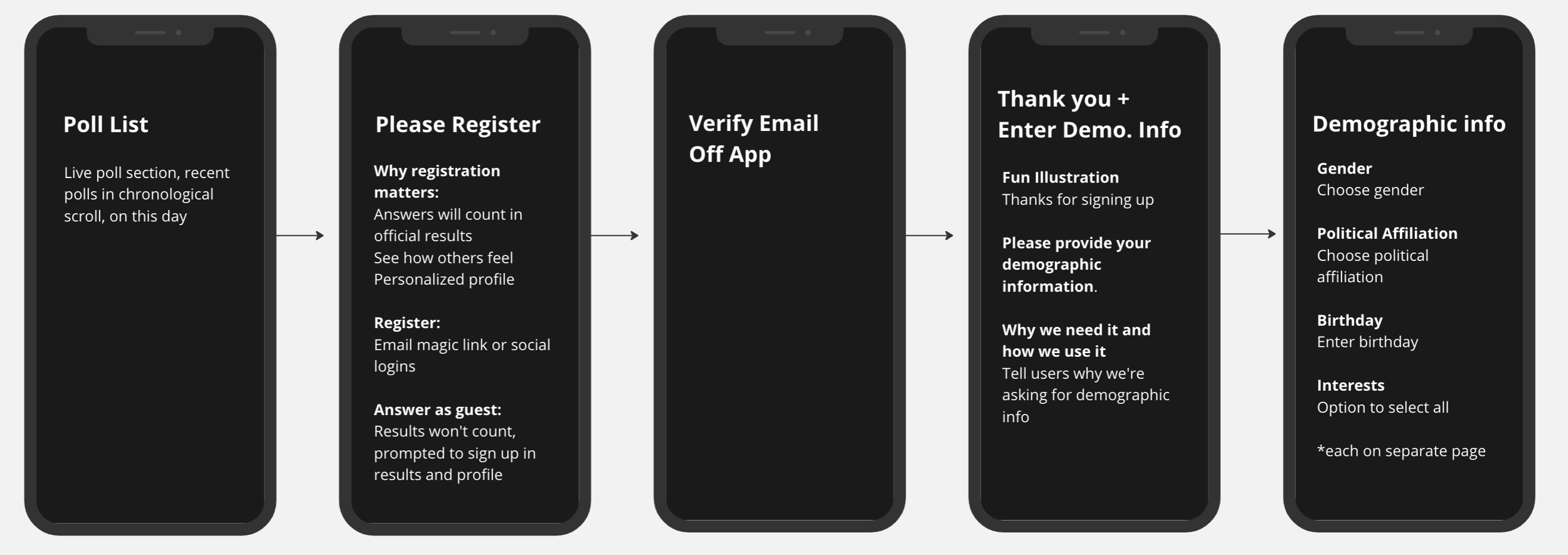
Registration Wireframes
I created wireframes to ideate on what the registration process would feel and look like.
Early iterations included the introduction screen to address the pain point #1: a lack of transparency and value before being asked to register.
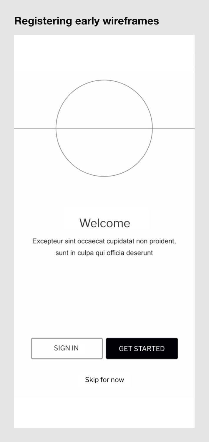
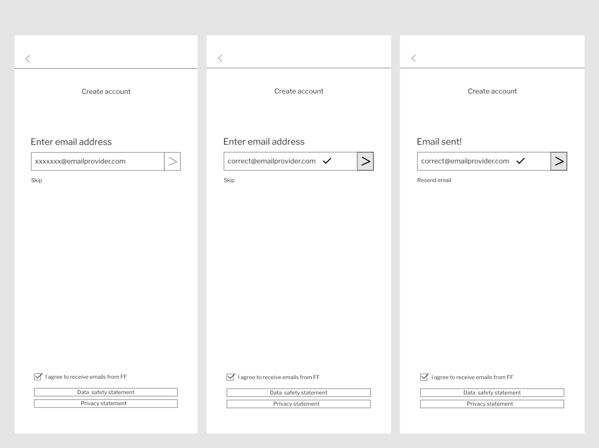
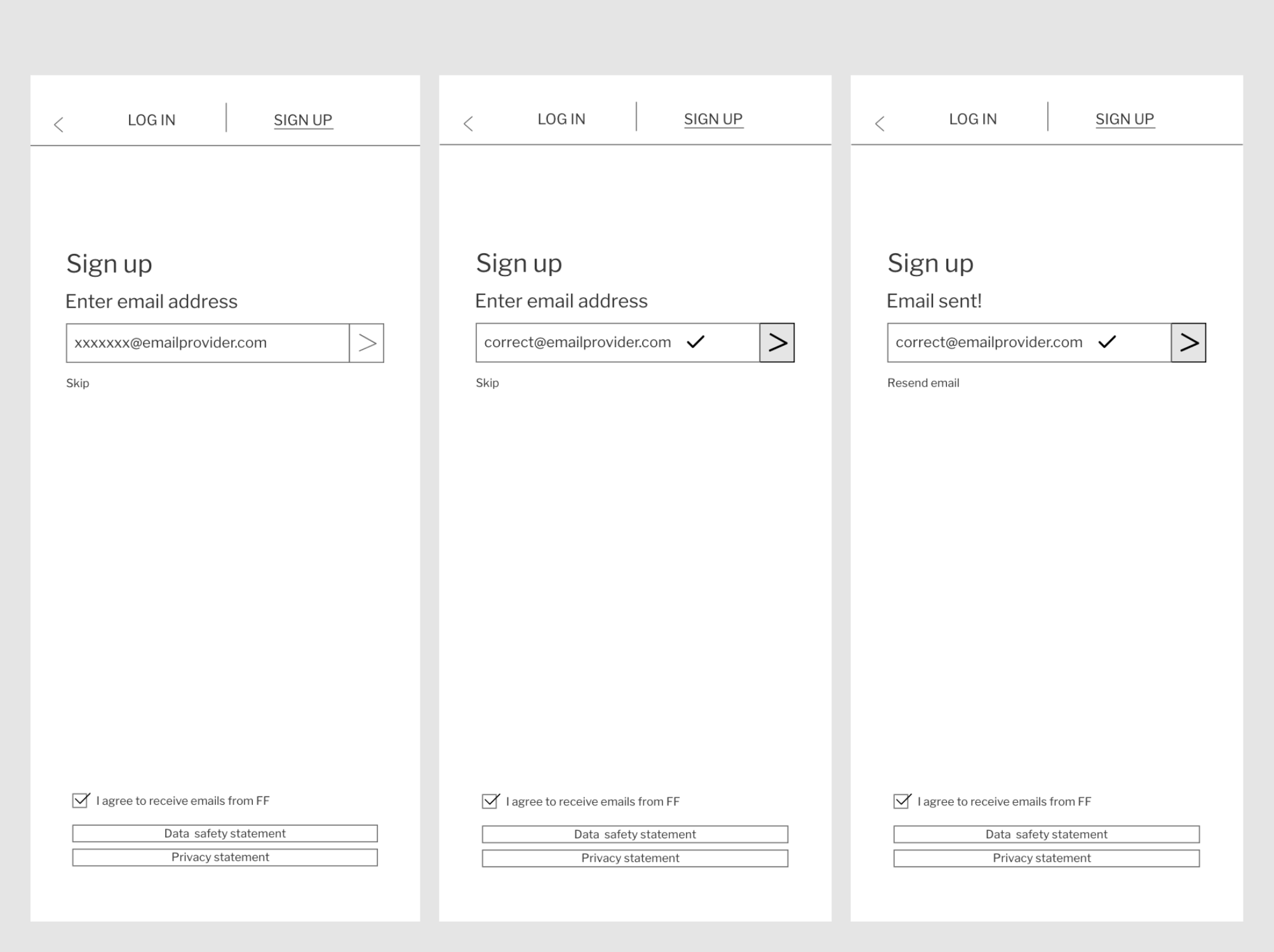
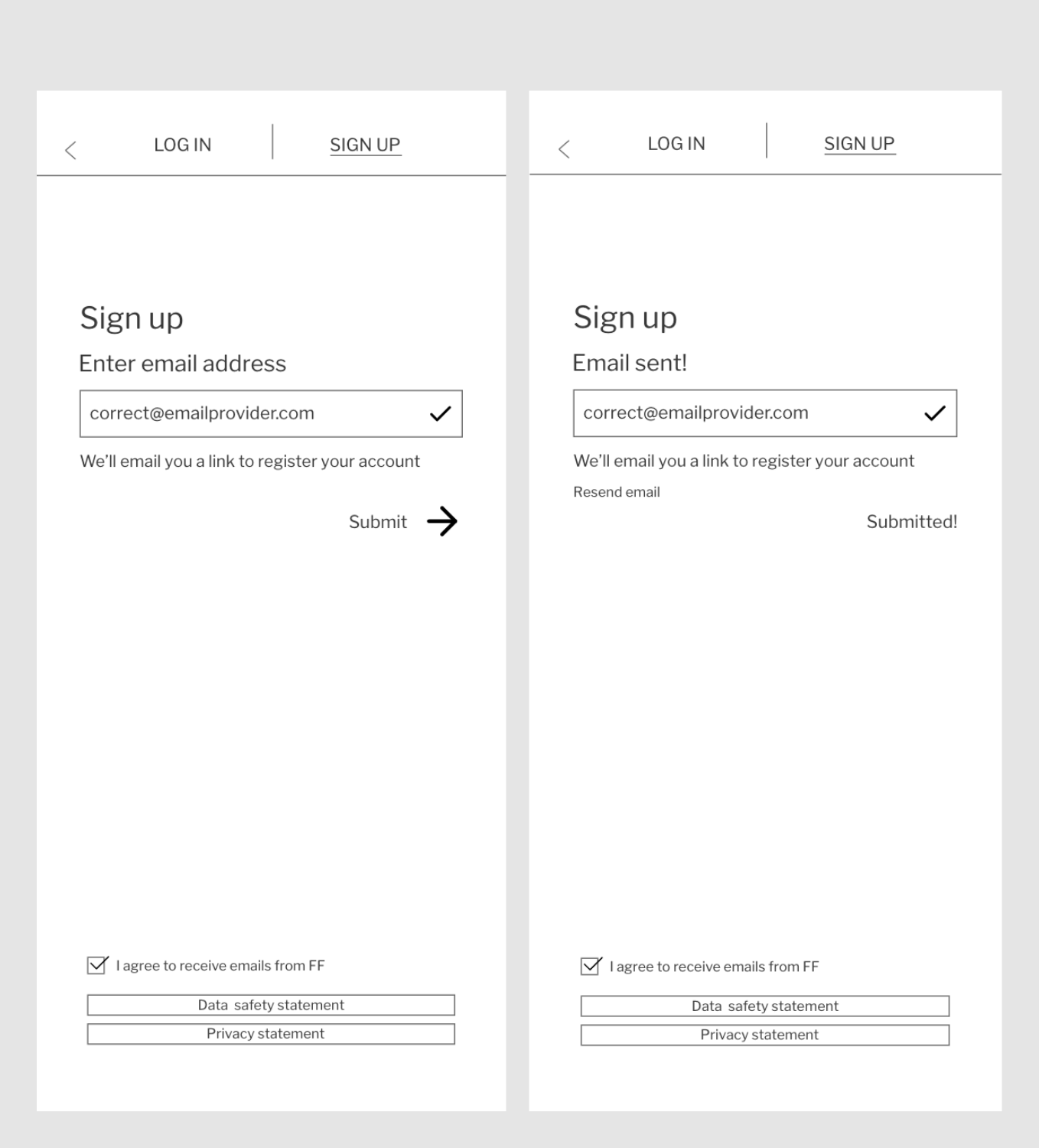
These wireframes show the skip option I added, as I wanted to give people the option to access the app without needing to sign up.
If skipped, users would be

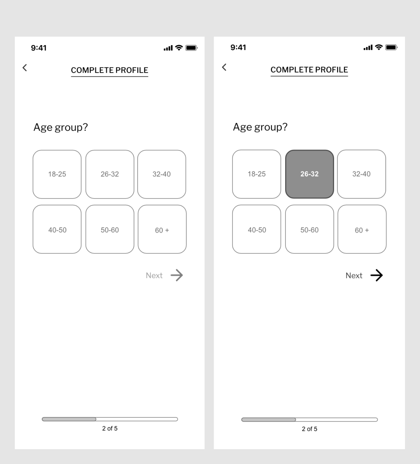
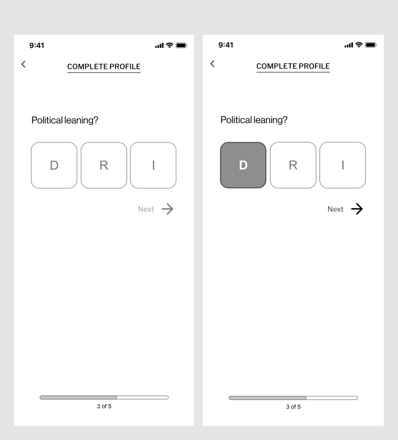
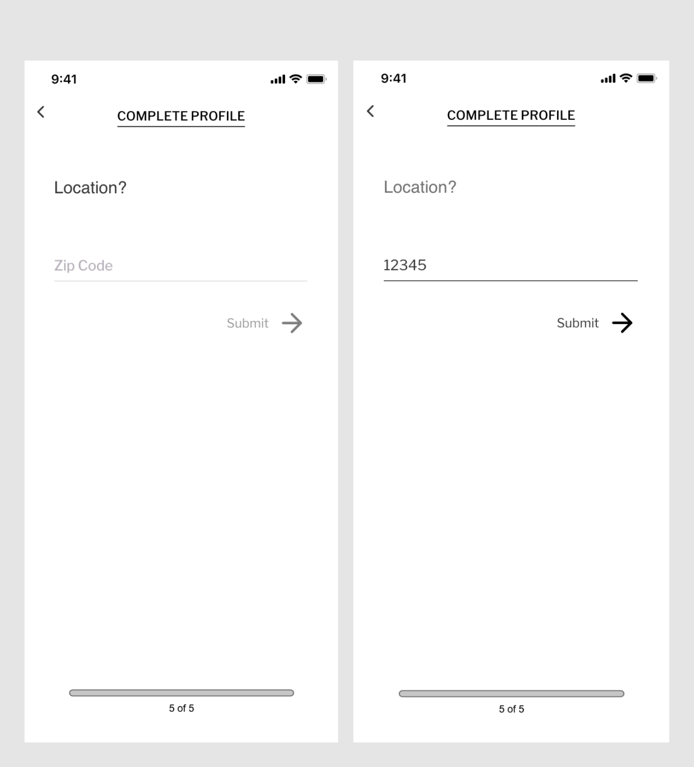
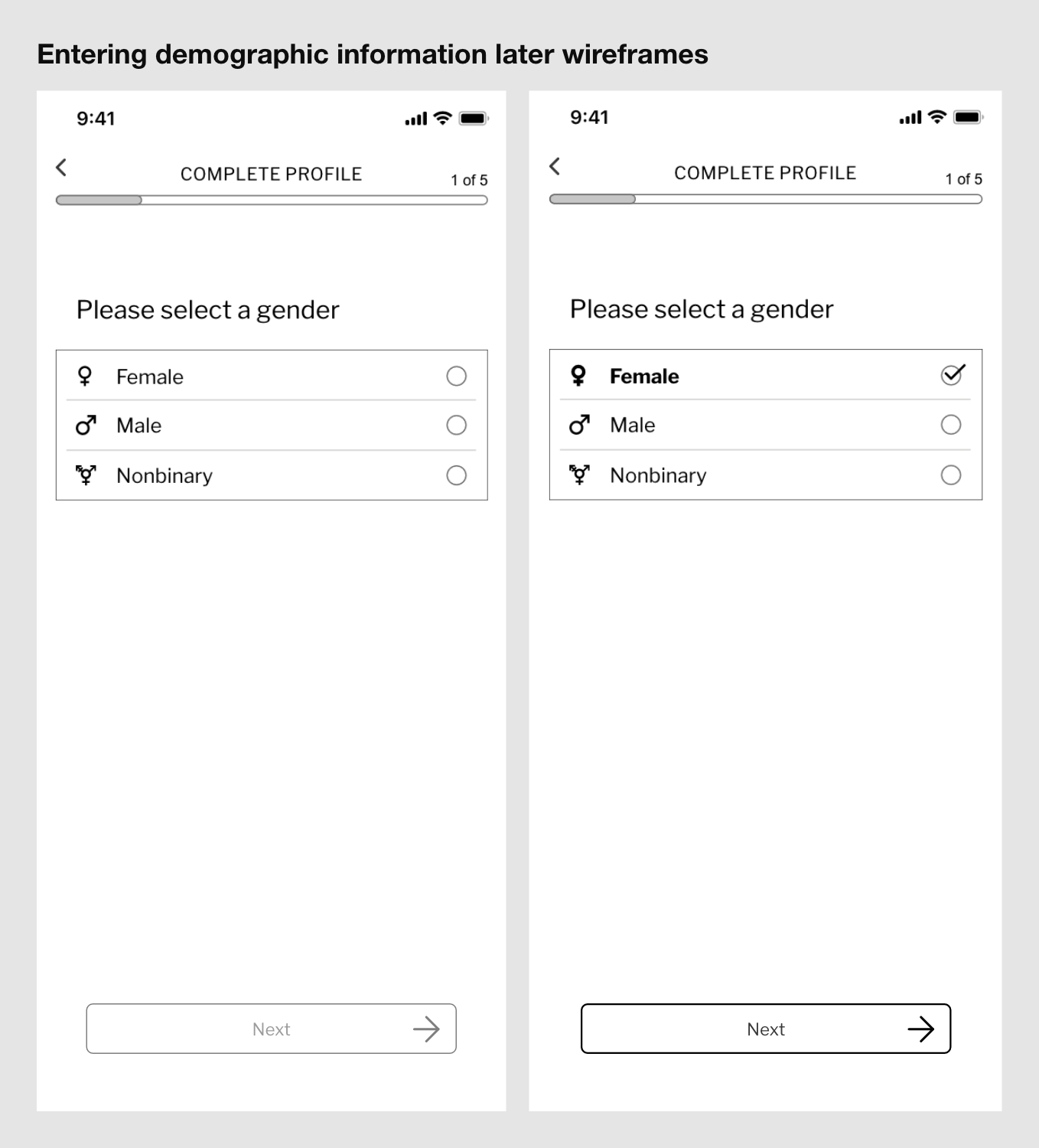
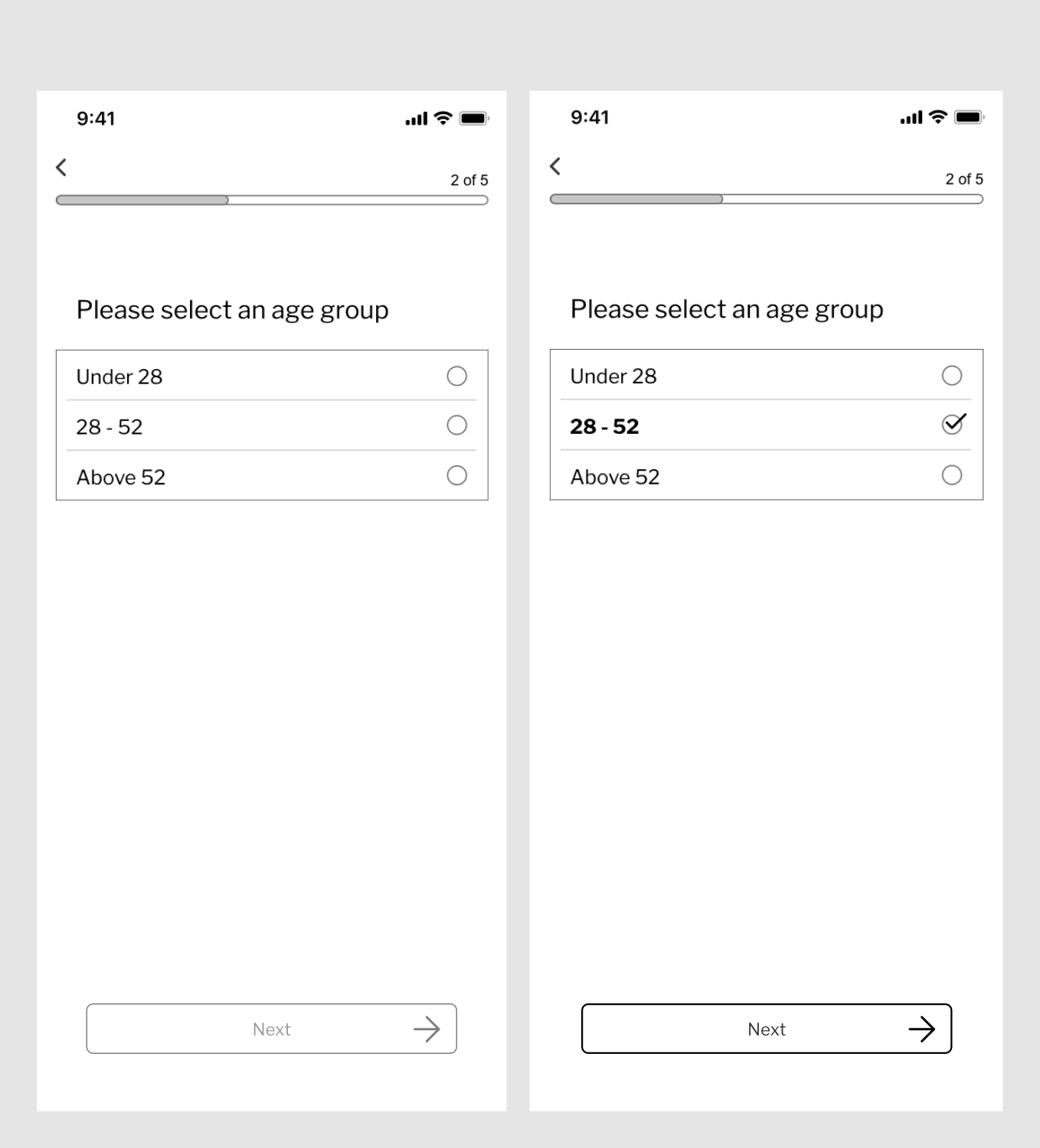
Demographic Info Wireframes
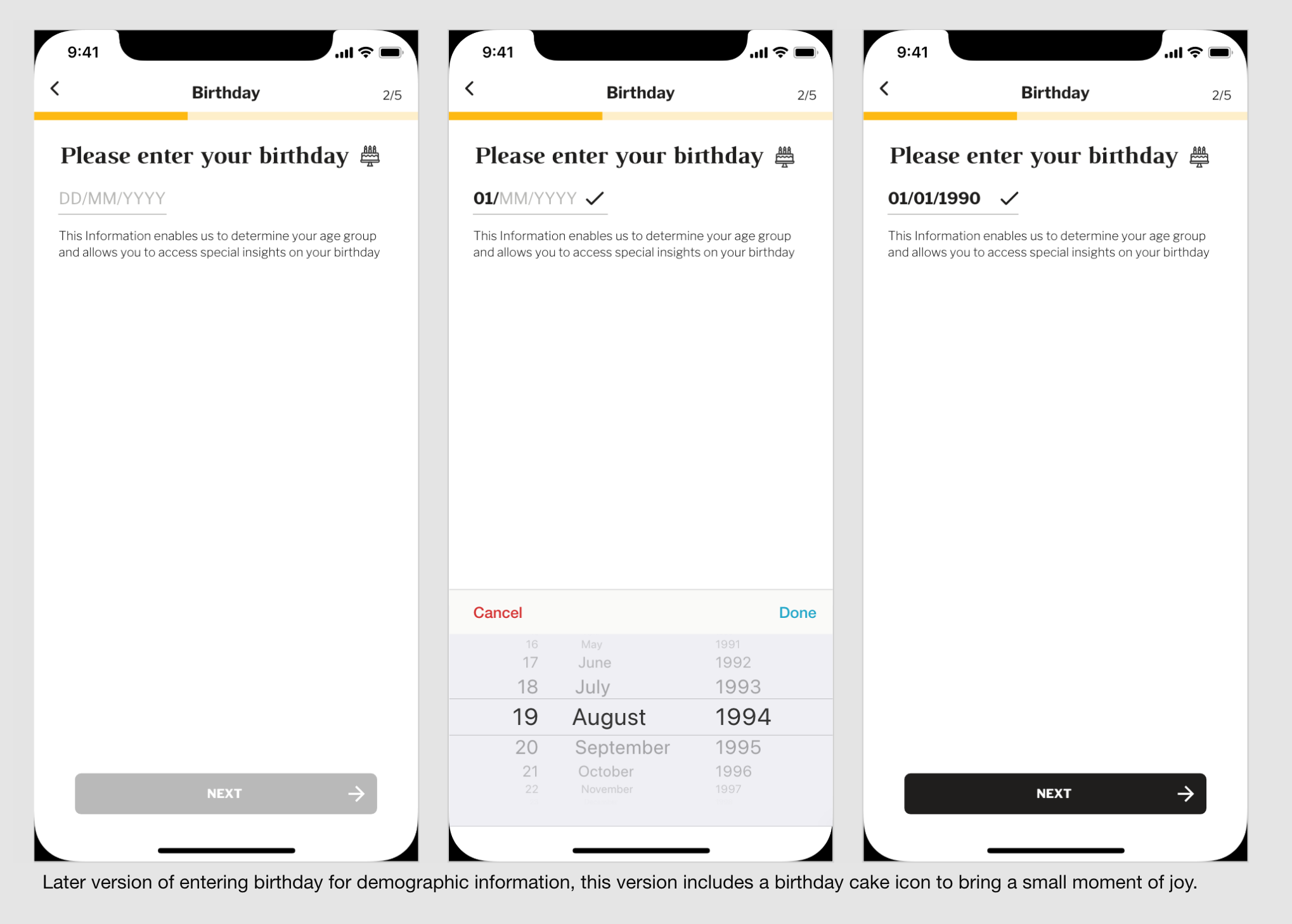
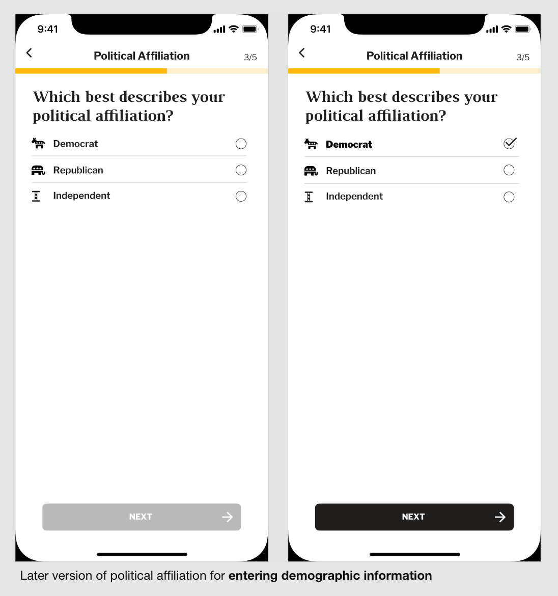
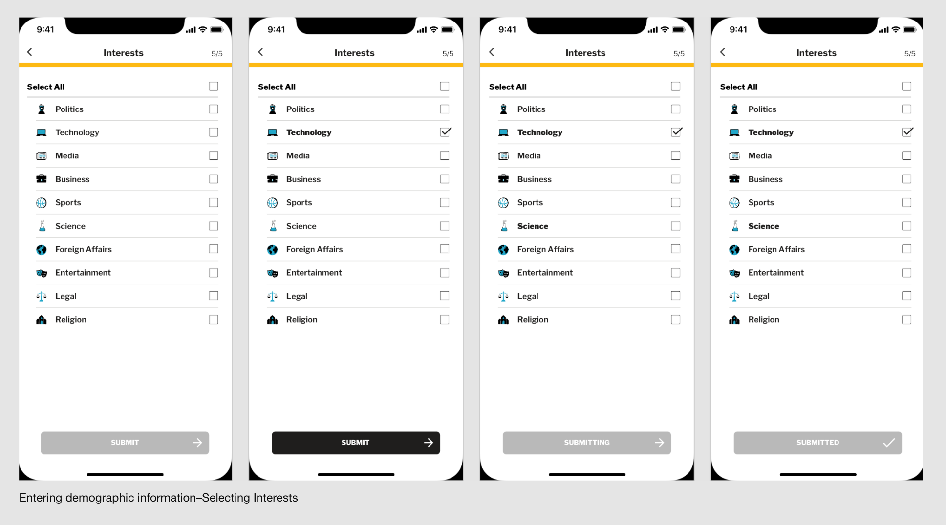
I iterated on different variations of the demographic information process, collaborating with the founder and developers to receive feedback, inform designs, and ensure that the designs could be implemented.
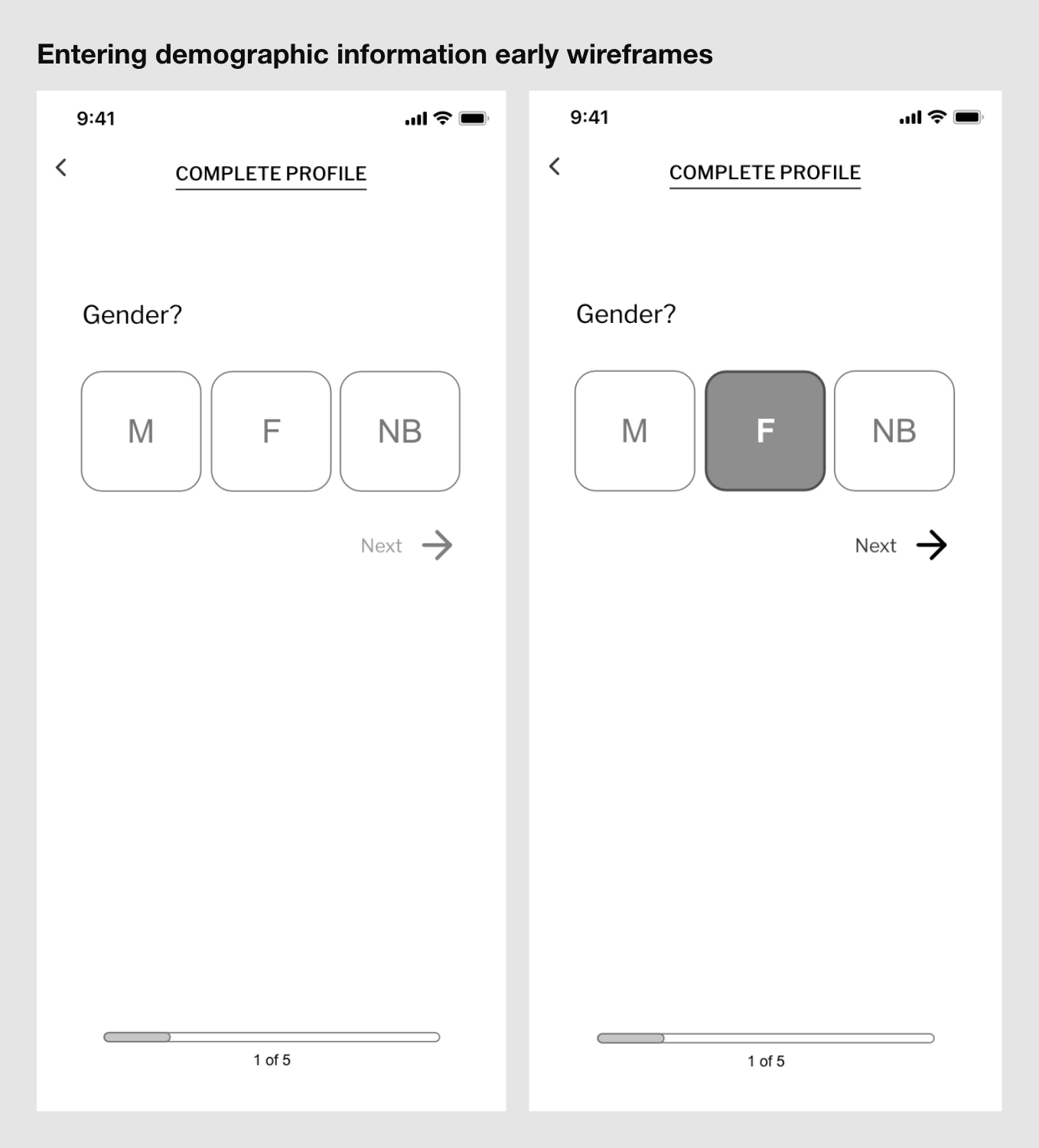
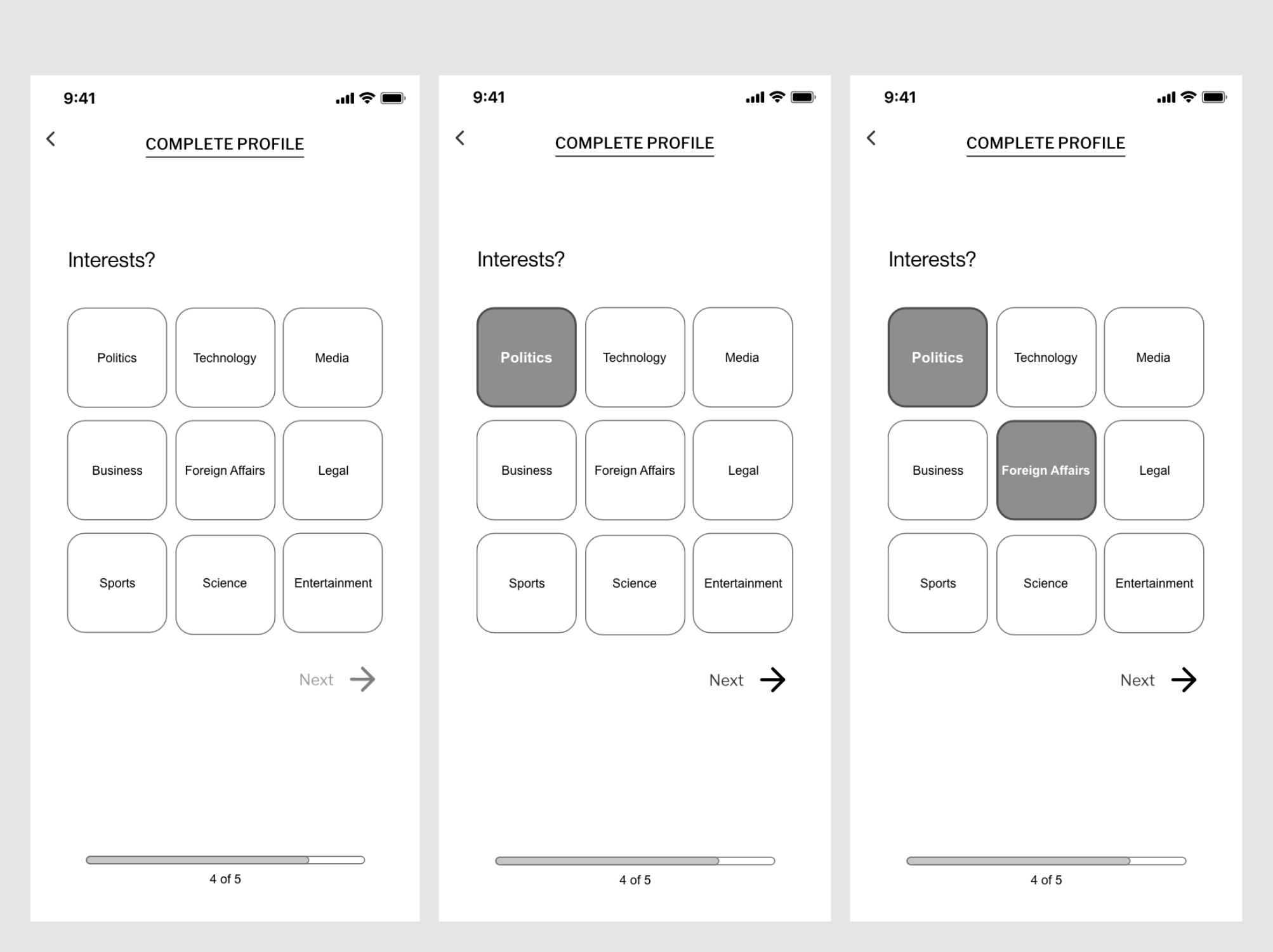
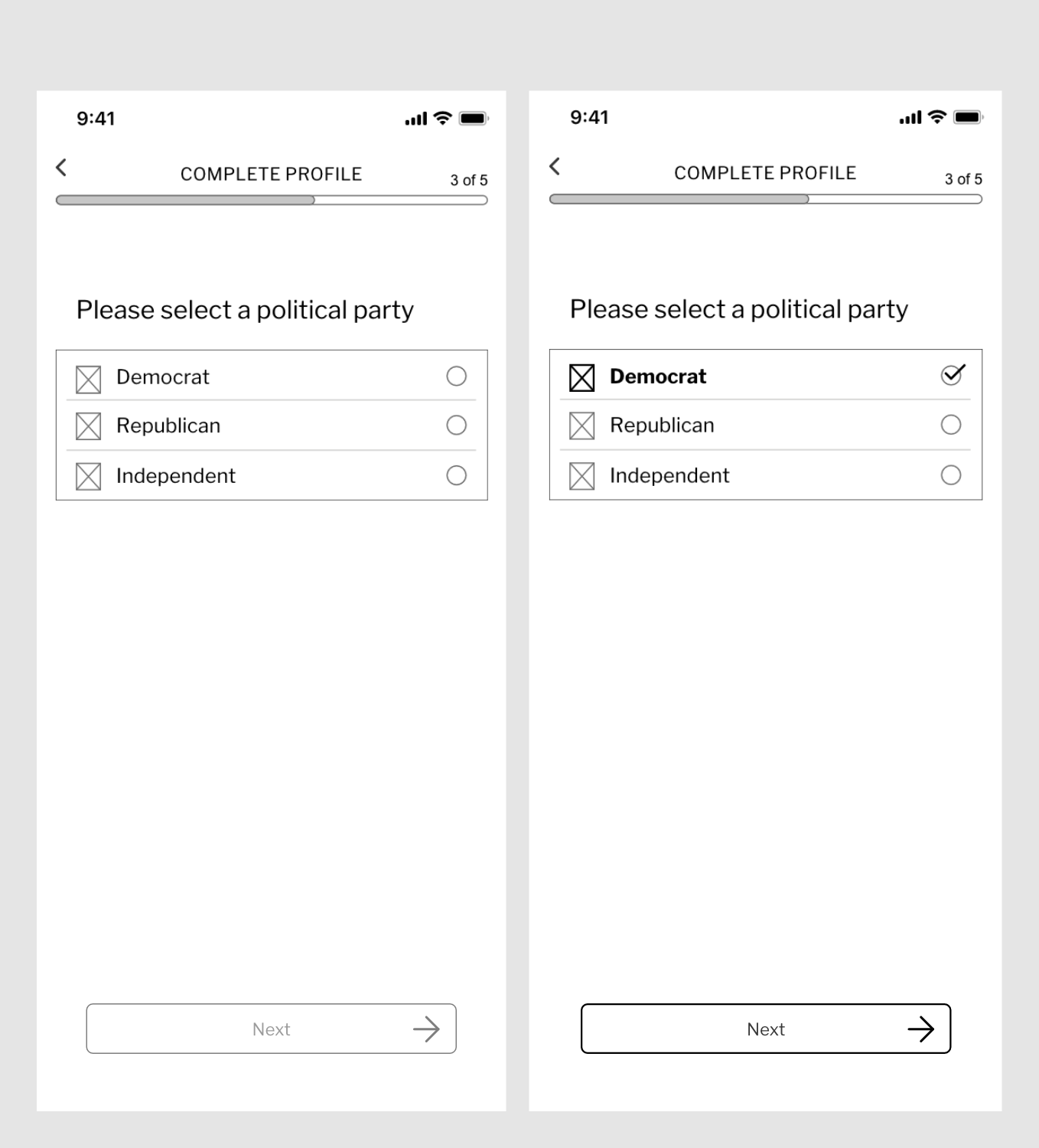
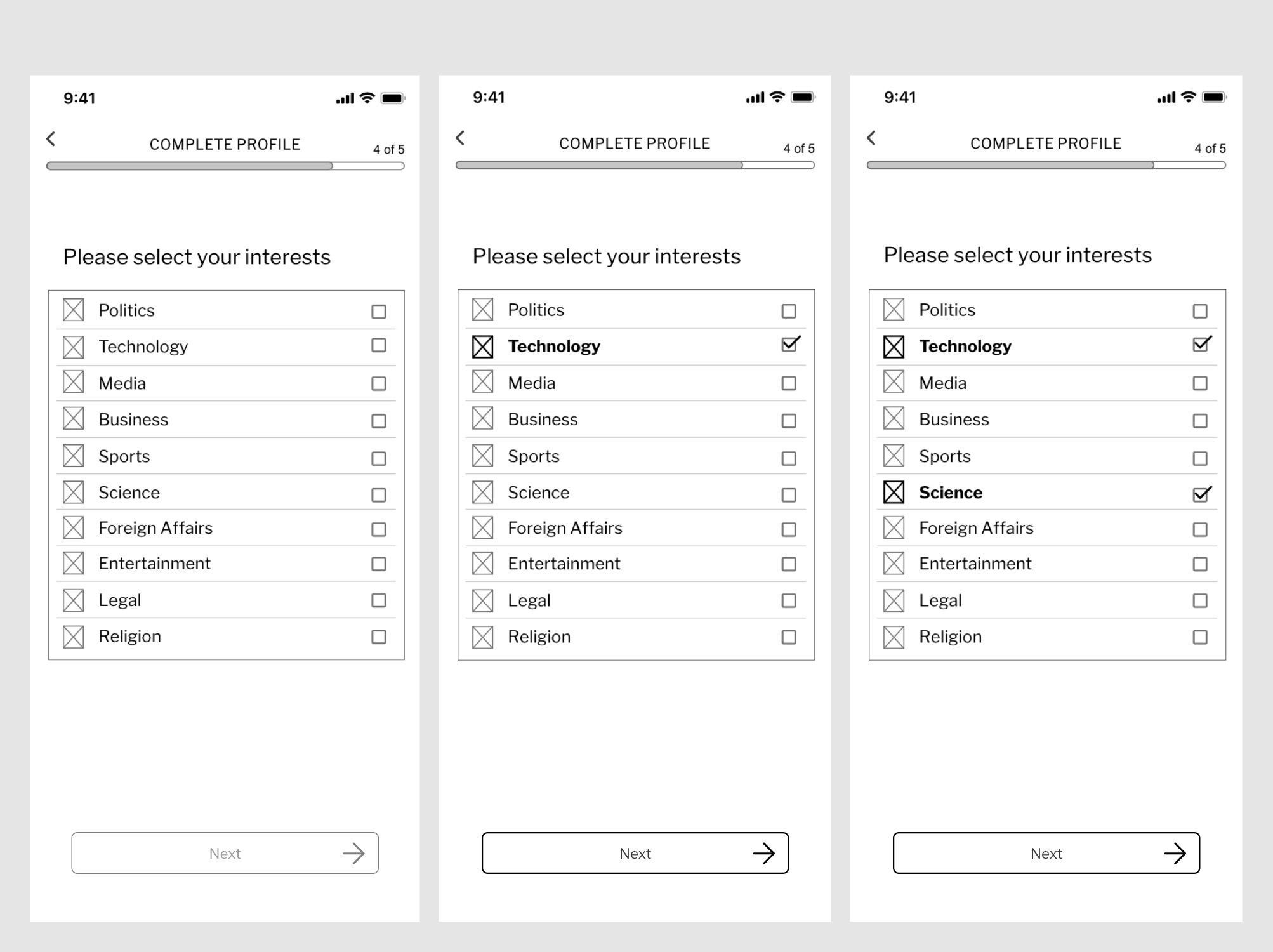
A solution that touched upon the lack of
transparency and trust, as well as expressed impatience
with the process, was trimming down and
We needed the users to give their personal demographic information for the polls to be accurate, but we had to think about what was really necessary so that we were not asking too much from the users, and accidentally make users feel uncomfortable or feel overburdened.
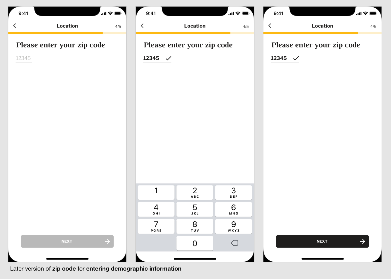
The original app, and many designs during our iterations, included a zip code to send personalized location polls and use location to help provide more data about how geography affects opinions. However, we ultimately decided against it as it felt like too big an ask and we didn't have the resources nor large enough user base to ask specific location questions at the time.
Allowing Users to Skip Ahead: Accounting for Different Sign Up States
As we wanted users to be able to
This creates
This meant that we needed to make
Depending on their state, they would be prompted to register or enter info before taking a poll and in the results. A user's ability to access certain features such as the profile would also depend on their state.
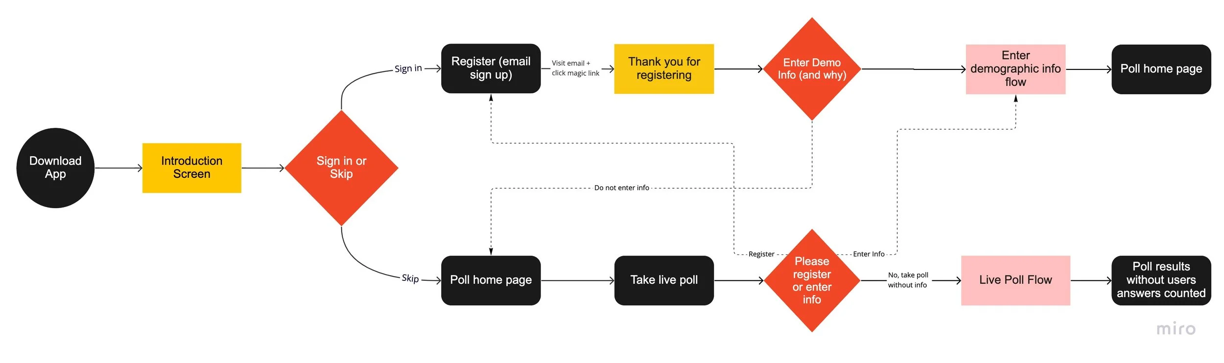
Early registration to poll flow accounting for different user states and where they would be prompted to register or enter information
Show First Ask Later—Changing When Onboarding Happens (Again):
While iterating on the registration process, we
determined that
Updated New User Flow:
Upon downloading, users will see the poll list home page first. When they tap to take a new poll, they will first be asked to create an account. They are told they can still take the poll, but their results will not count unless they have registered.
If they proceed to take the poll without registering, they will be asked to sign up again on the results page and in the profile section
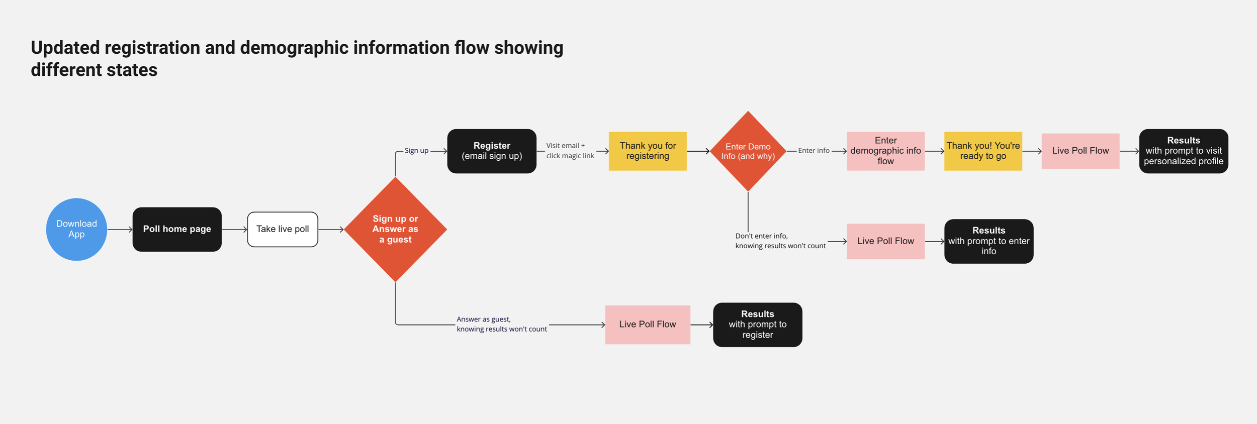
Final version of registration to poll flow, where user first enters app on the poll list, and then is prompted to register
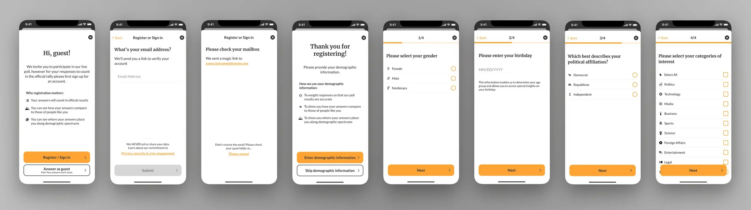
Updated Prototype
I worked first as the sole designer on the prototype, and then together with two other designers to finalize the UI. I was constantly collaborating with the founder on the designs, testing them via hallway tests, and iterating based on feedback and results.
As per the updated flow, the onboarding process is triggered when a user goes to take a live poll. The results screens, profile, and search pages also have prompts to begin the process.
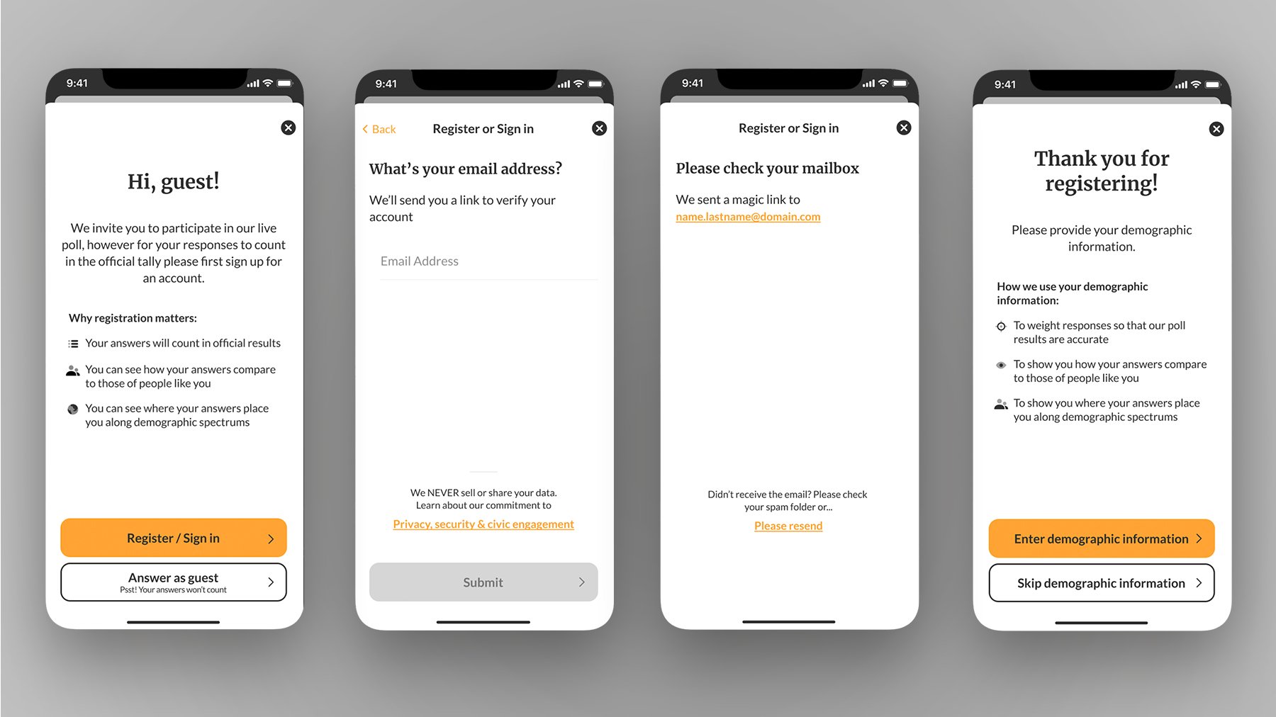
In the latest iteration, we changed the page style from a normal page to a full screen modal experience, with the addition of a close button to give users an exit at all times without them having to skip through each section to leave.
Rather than trying to relay information via the introduction page, we kept the first registration page simple, letting users know what we needed from them, and why.

Testing
During testing, users found the registration
and entering information sections easy to navigate,
and some
The first testers didn’t like feeling forced to provide demographic information as the “Continue without demographics” looked hidden. They said it lowered their trust increased the chances that they'd delete the app. Changes to the screen fixed this issue and the next testers reacted more positively.
Testers paused at the zip code section of the demographics. They didn't know why it was necessary and noted that the process could be shorter. After this feedback, we removed the zip code screen.
After removing the zip code screen, the following testers responded well to the process and didn’t have problem with the amount of questions.
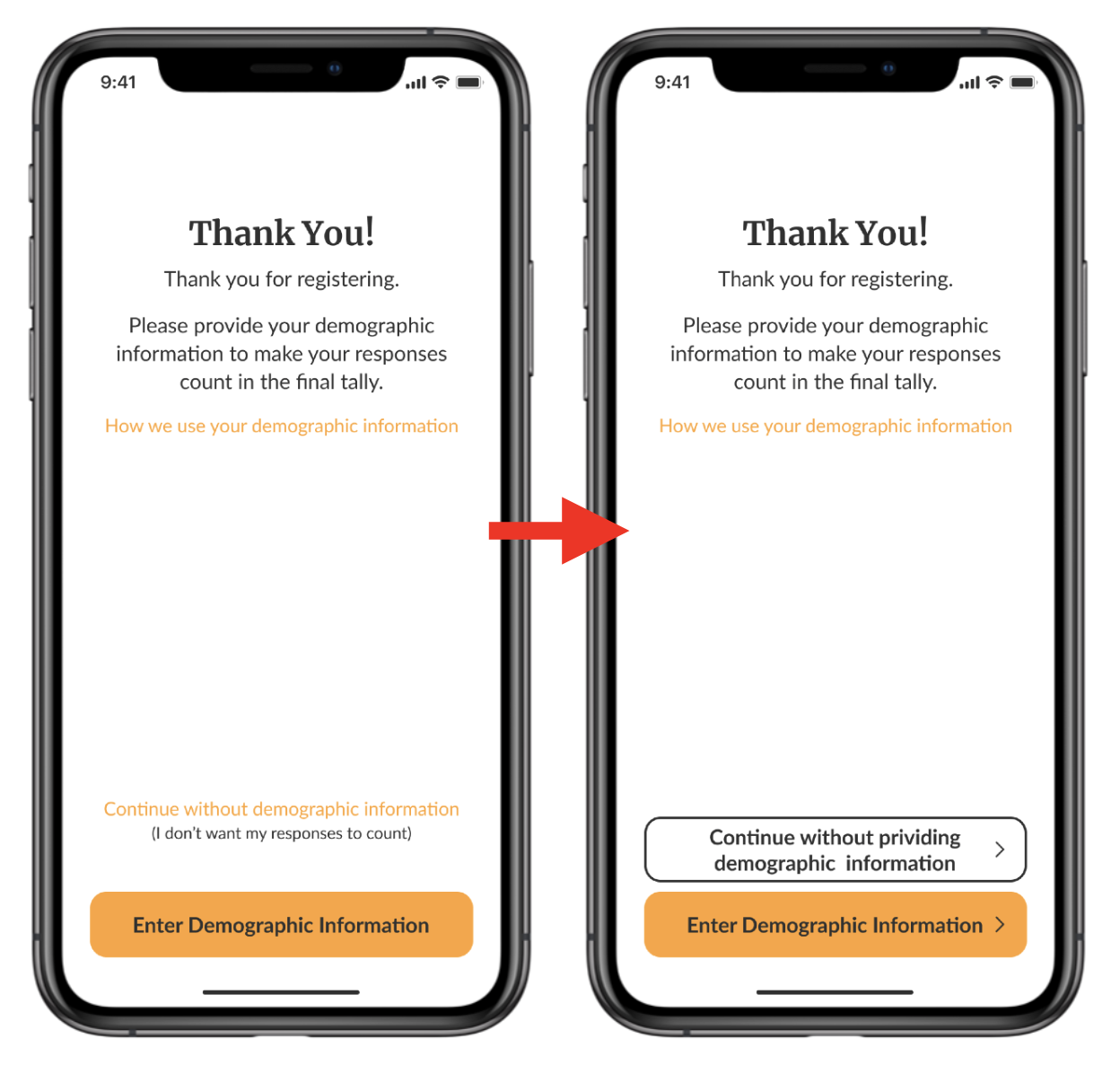
Changes to the screen that asks for demographic information increased user trust
Outcome
The redesign of the user registration and onboarding
experience reduced user
drop off by 30 points, with an
Analyzing data from badges earned, we learned that (read more about badges)
Overall, active users increased by nearly 300% from our efforts, and retention increased by over 100%.