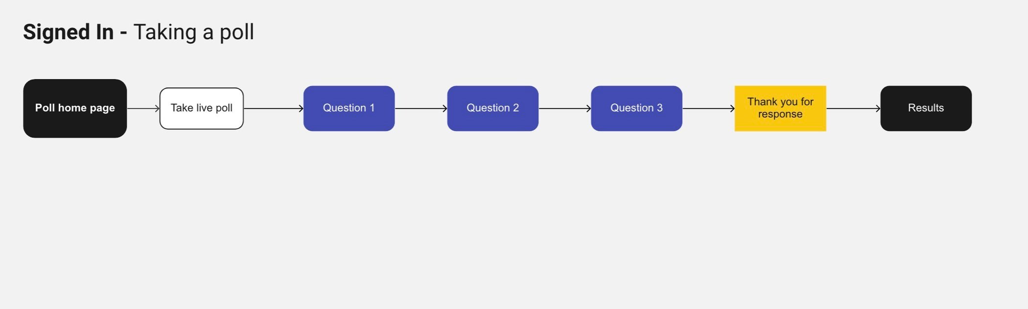
Designing the Poll Process
Final UI Design + Icons (2021) ☞ JOZEF KOLACZYK
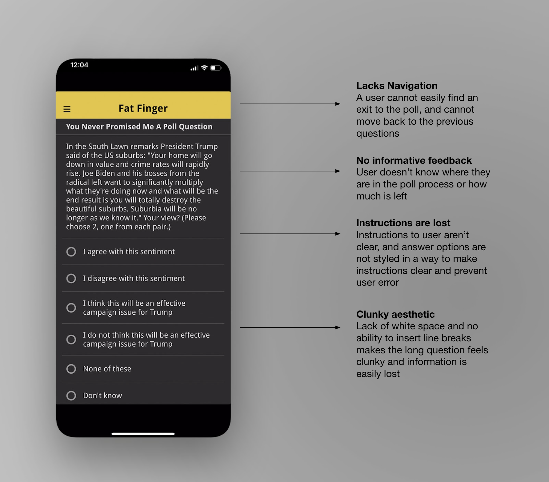
Problem
User did not have the ability to navigate out of the poll or to previous questions, and there was only one style for all polls no matter if was a single choice, choosing from each pair or group, multiple selections, etc. The experience also didn't provide any moments of delight for users, nor thank them for their time and response.
Solution
Upgrade the poll taking process to include user controls and progress indicators, as well as different structures depending on the type of answer options
To better understand the user perspective and develop solutions, I conducted user research, reviewing store reviews, user feedback, and analytics, creating empathy maps and personas.
Through my research, I learned that users had trouble finishing the polls, coming across confusing question styles and instructions as the polls didn't have diverging styles for different types of questions, such as multiple choice or picking from pairs.
We needed different screens to reflect different styles of polls and answer options.
The founder and I worked on a spreadsheet that broke down the different styles, as well as a clear description of each.
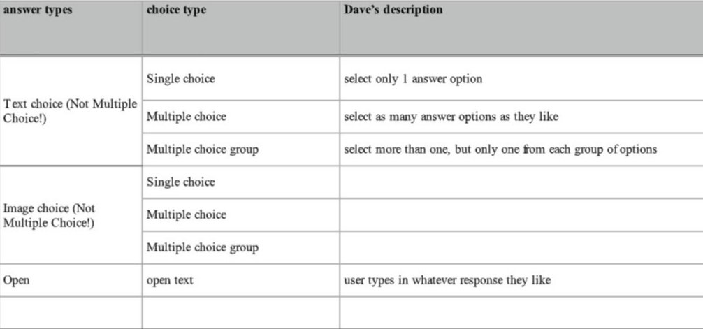
Screenshot from excel showing description of different kinds of poll answers from the founder
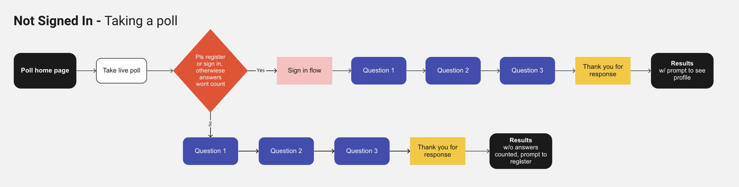
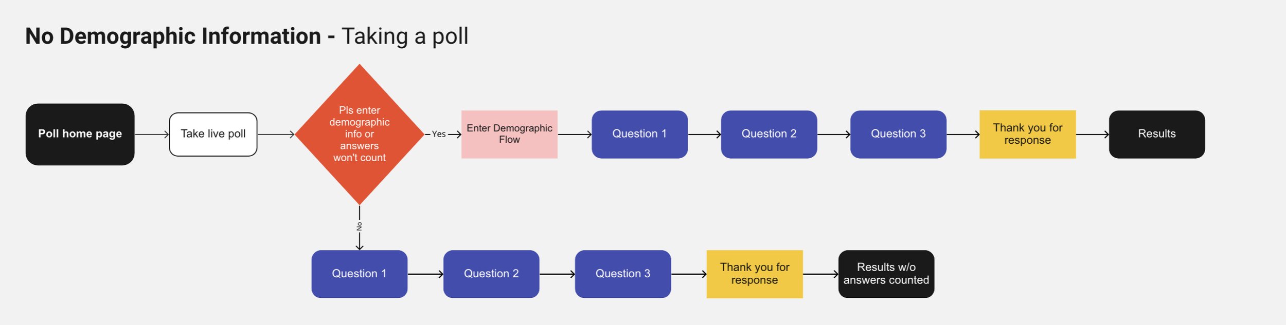
As a user could take polls as a guest, even if they hadn't registered nor entered their necessary demographic information, we created different versions of the poll taking experience to account for their signed in or not signed in state.
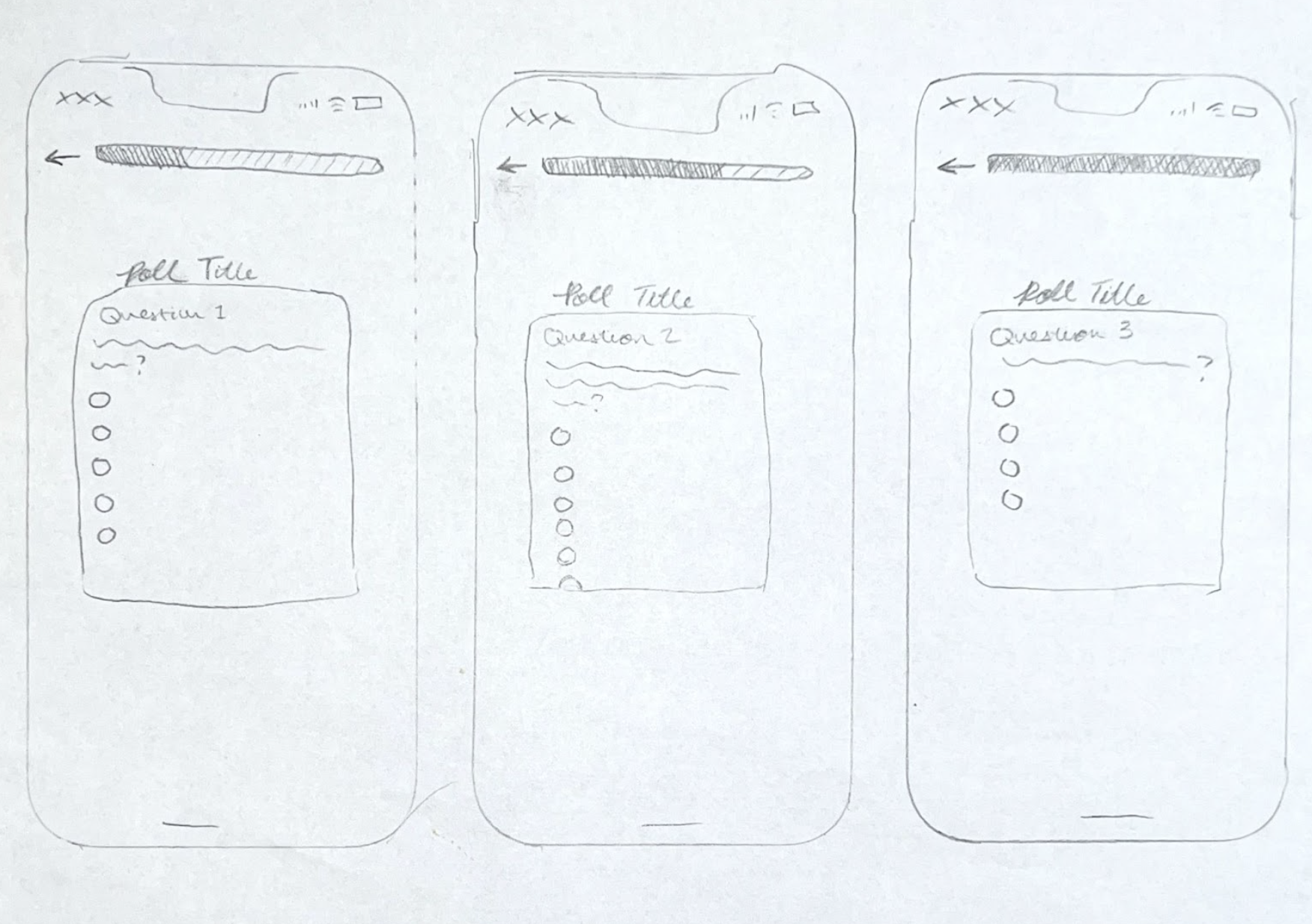
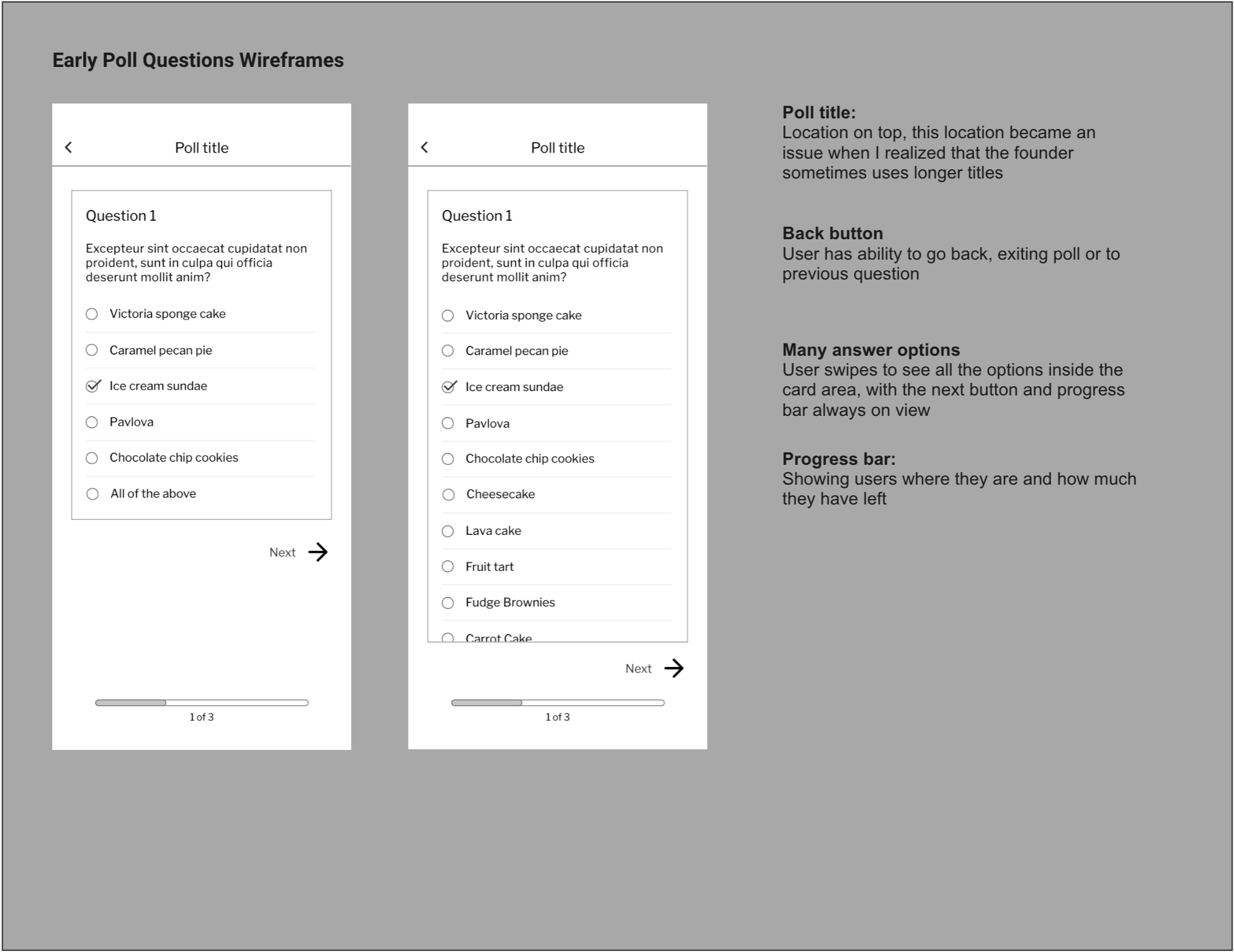
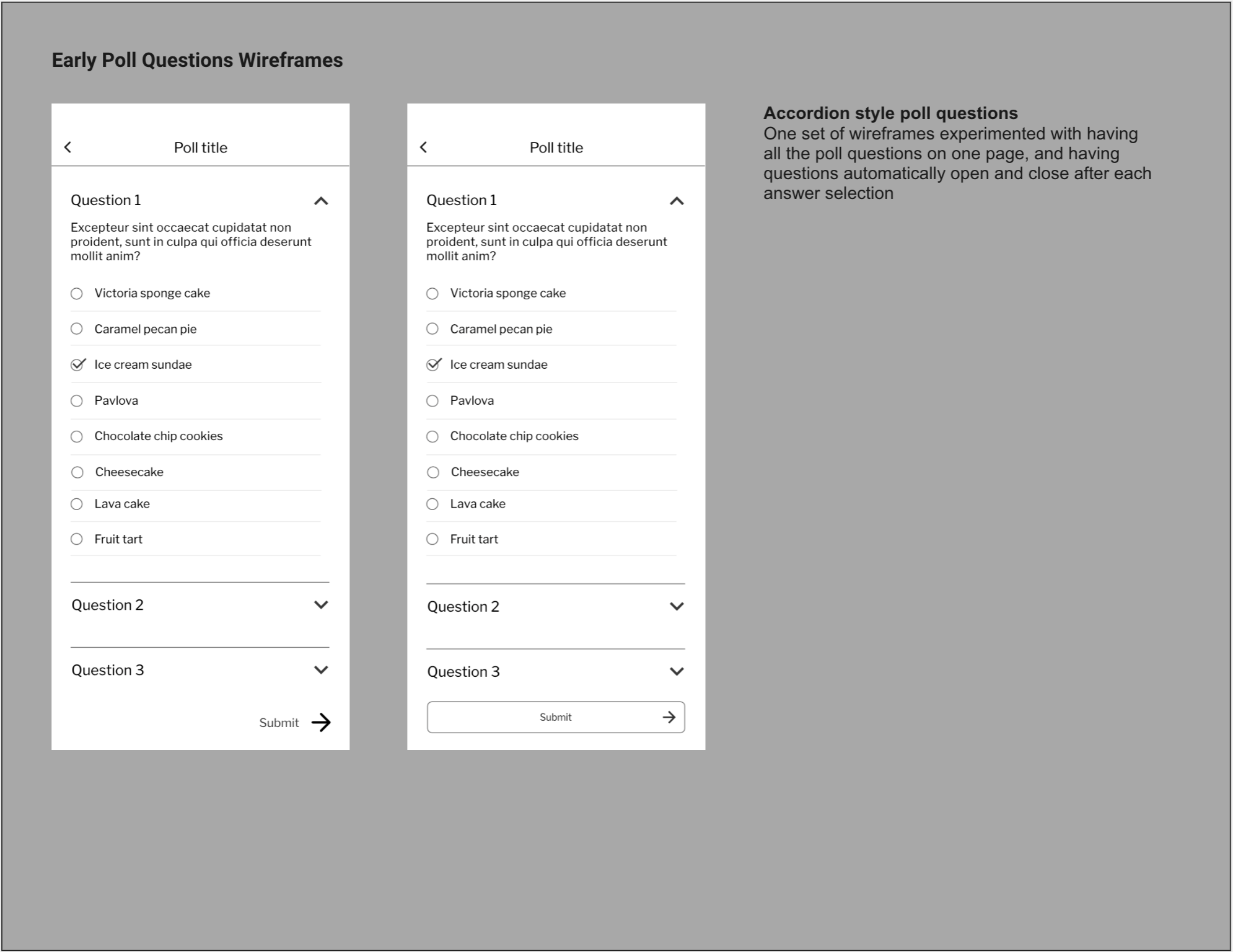
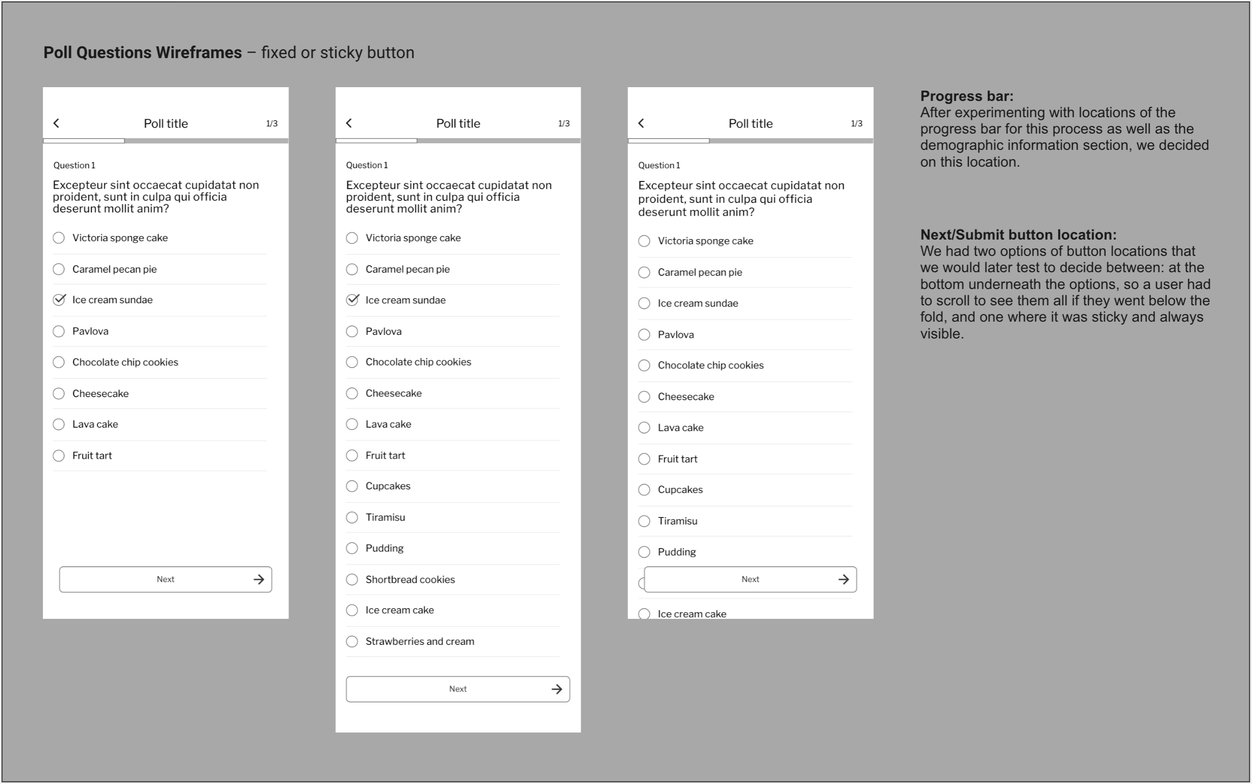
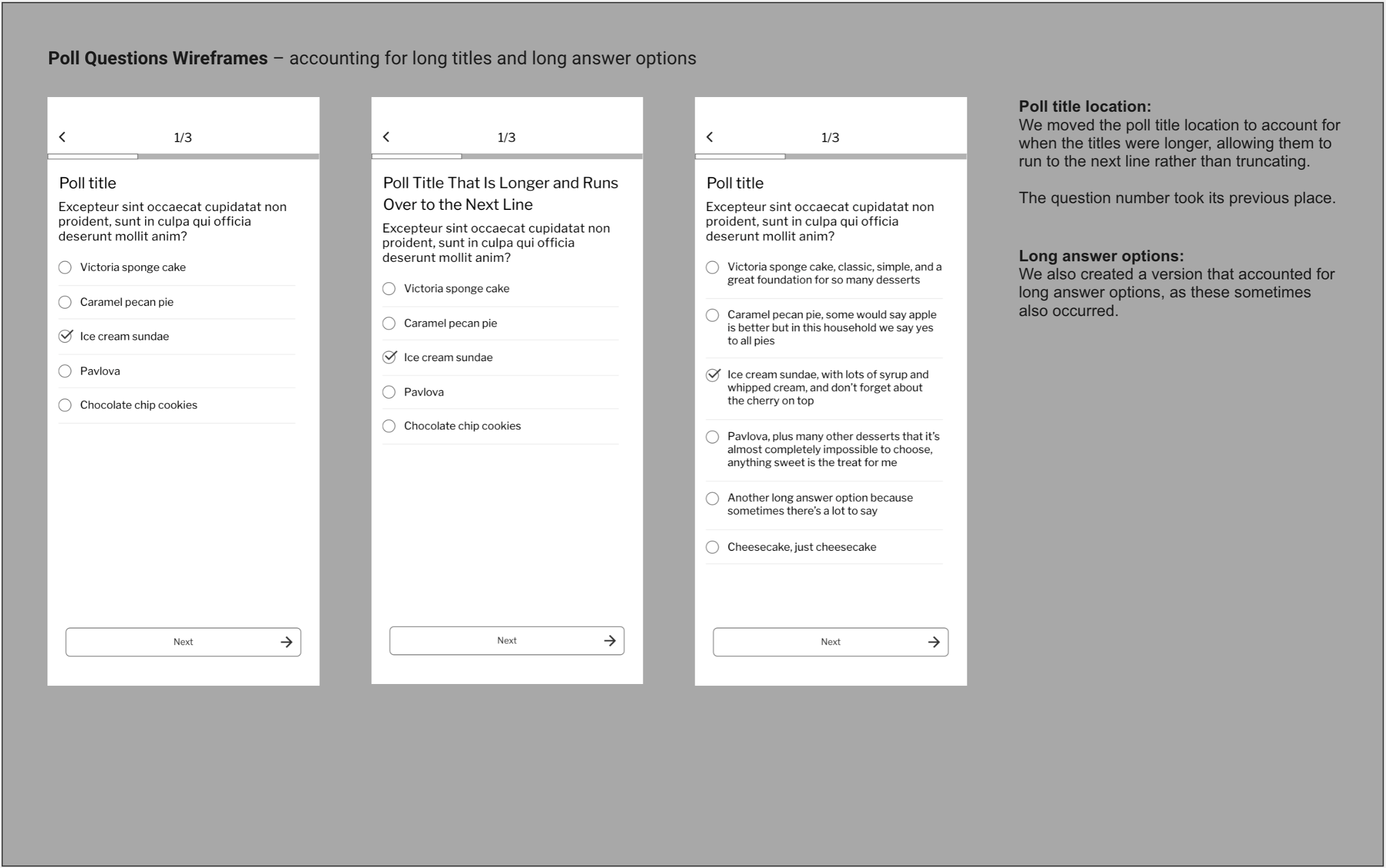
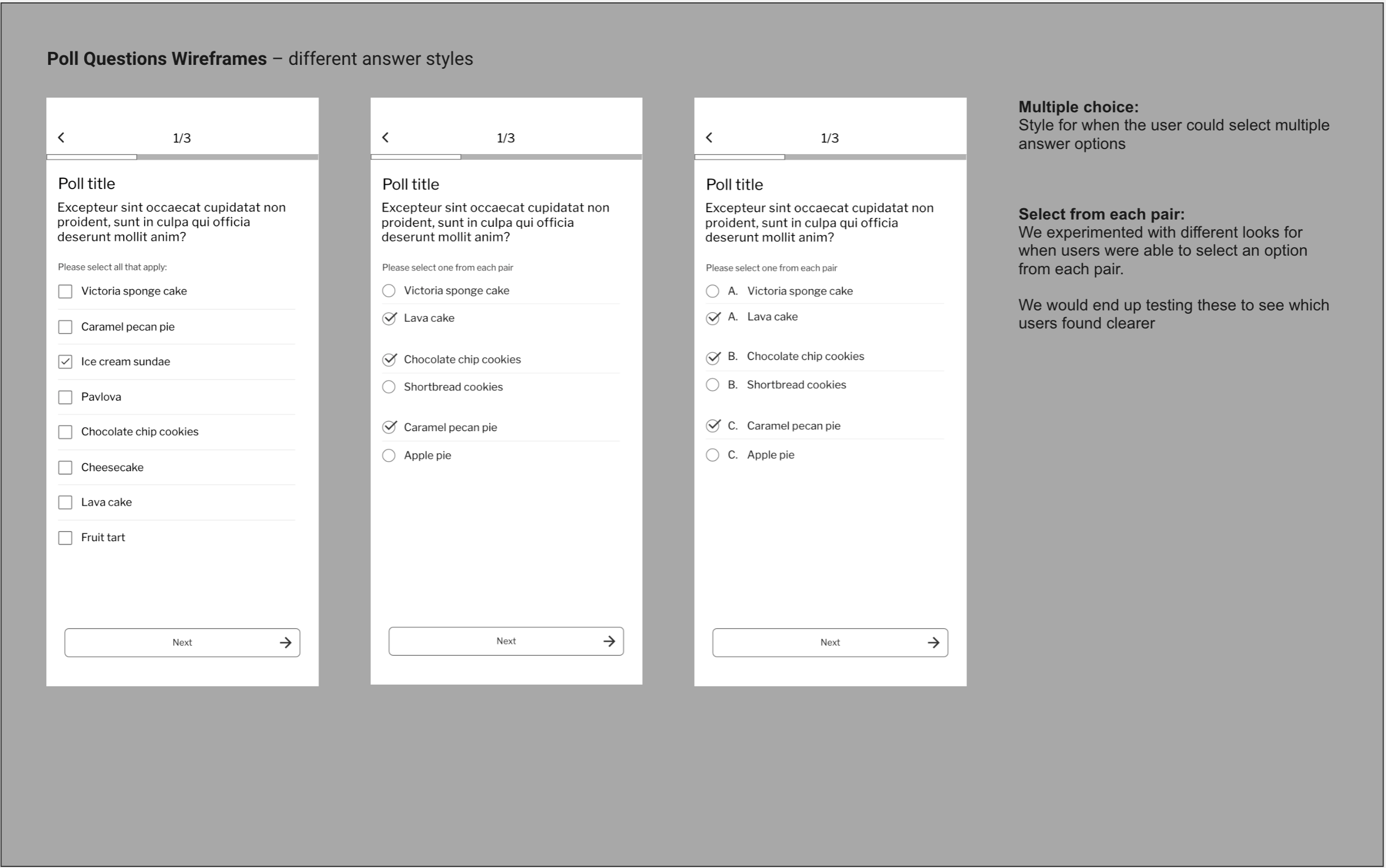
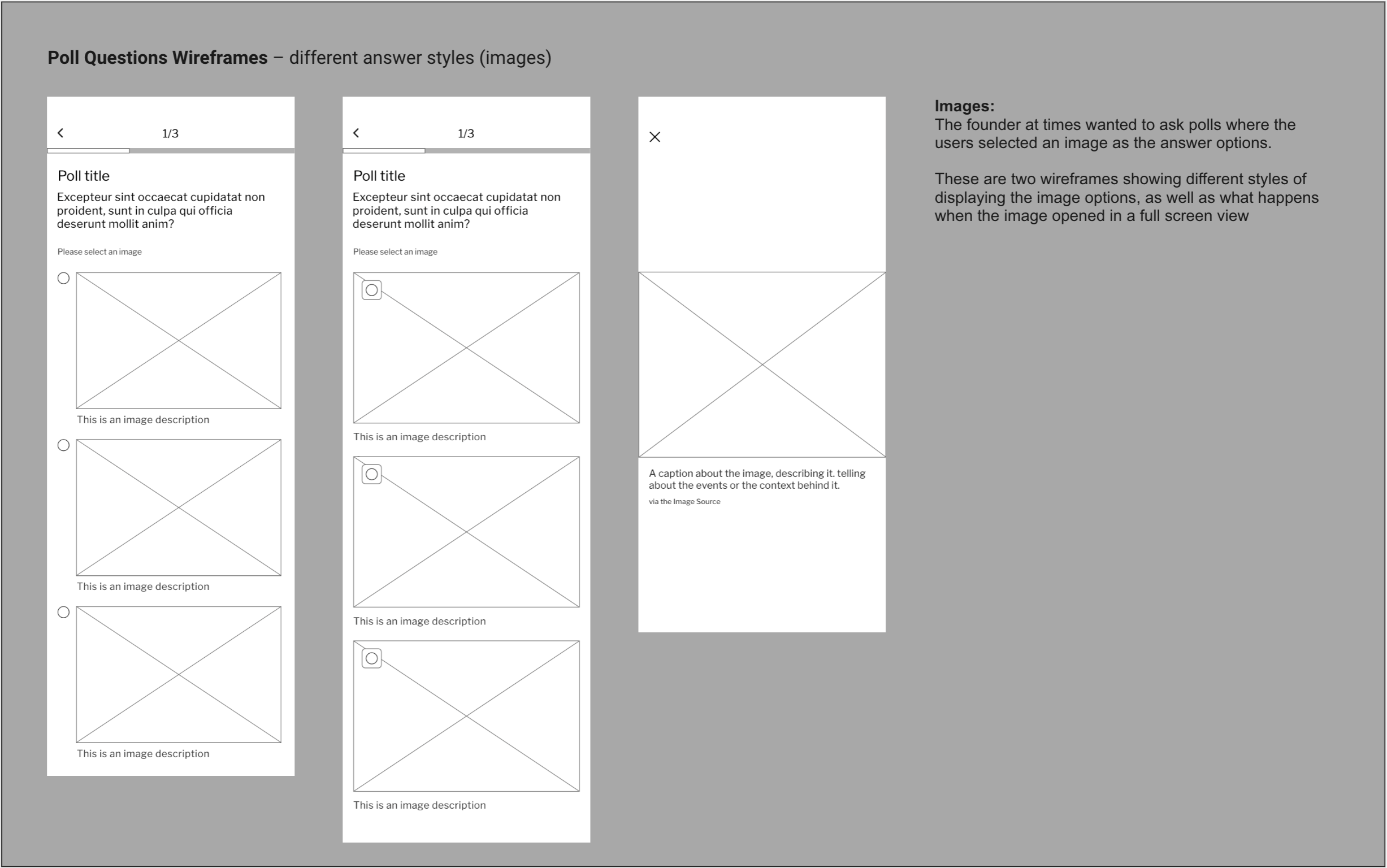
I created wireframes experimenting with different styles for the questions and answers, iterating as I went after receiving feedback from the founder and during hallway tests.
Animations and Interactions
To create a moment of delight and say thanks to the users, I hired an illustrator to create spot illustrations for the app, and created a small animation using on such illustration that would appear after a user completed the poll.

Animation created using After Effects and Lottie Files; illustration by Mia Berg
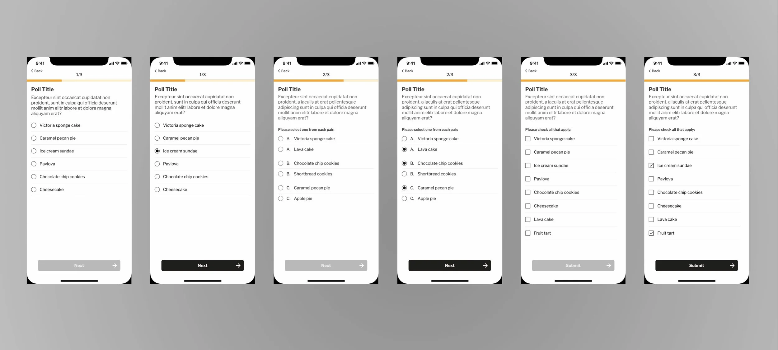
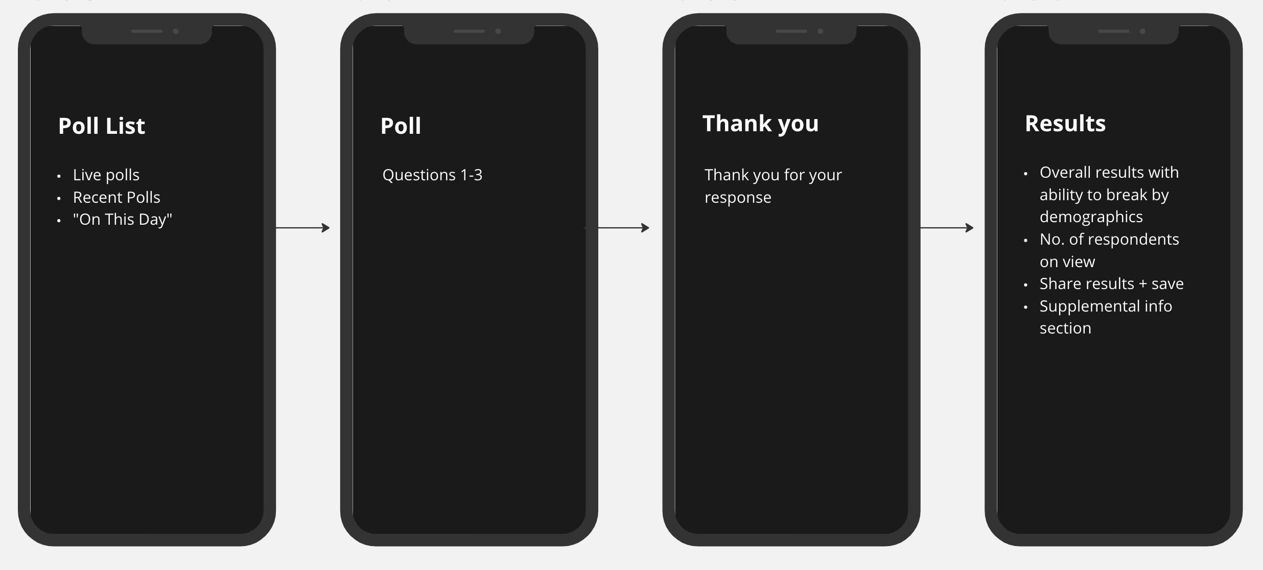
Screens showing my UI design
After the team expanded and we welcomed two outside designers to the process, we iterated together, creating the wires and conducting testing to decide on final screens.
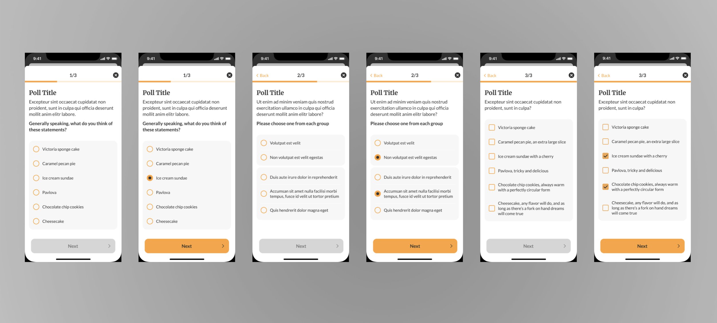
Screens showing latest UI design, done in collaboration with Kris Slazinski + Jozef Kołaczyk
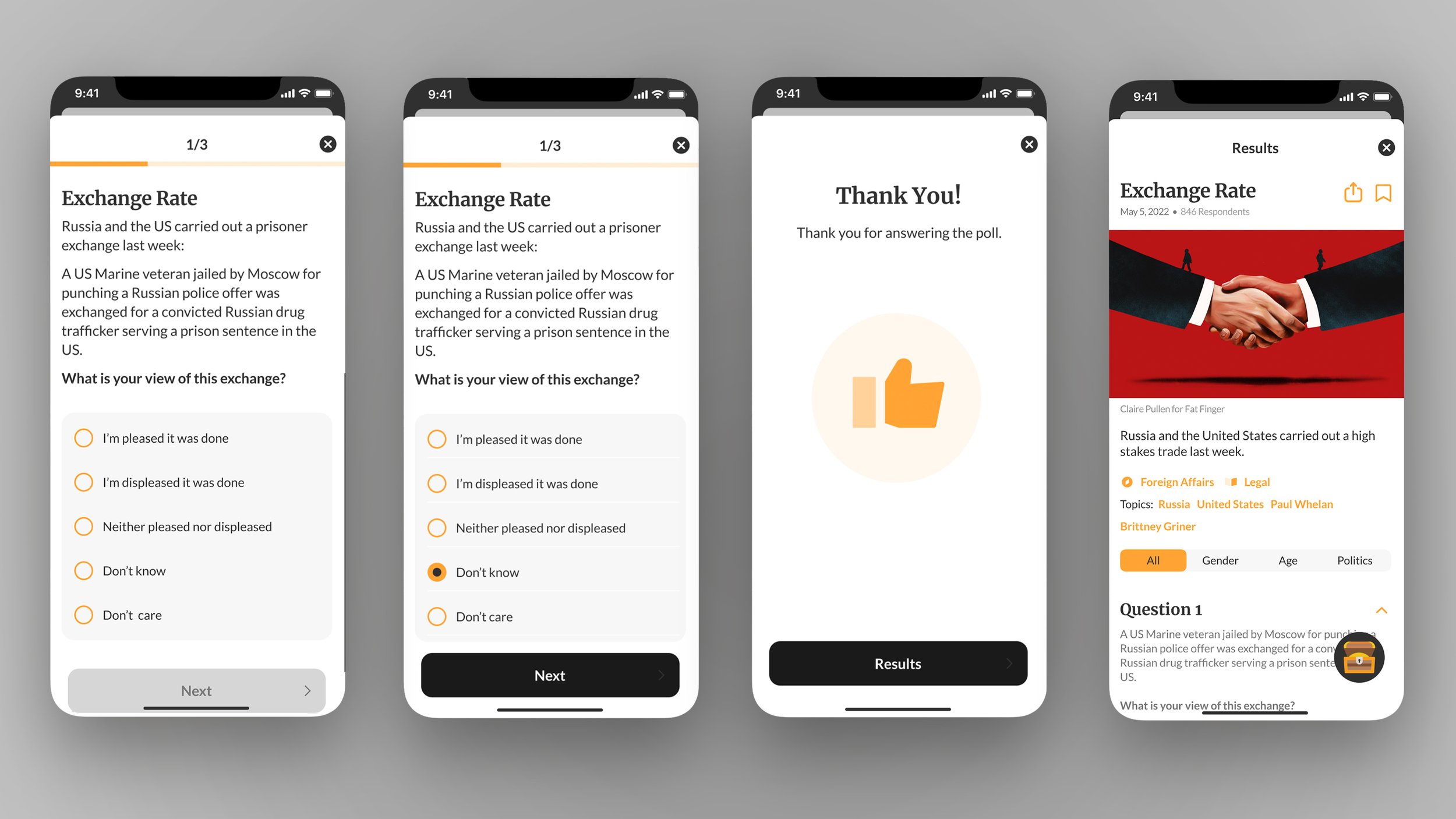
The final designs changed the style of the poll from a normal page to a full screen modal view, with an x to close and back button to see previous questions.
We also changed the background of the answer options to create more visual difference between them and the question, and incorporated more of the original brand color on the radio buttons and boxes, as well as the active next button.
Testing
We tested users' success in navigating the poll list upon first encountering the app. We wanted to see if it were easy for them to take a poll from the list, and monitor general behavior.
Testers immediately knew how to answer a poll, and 20% respondents wanted to look around the page first. We found that testers had no issue navigating the page, and were able to easily take a poll.
An issue did arise uring hallway tests, however. We found that almost everyone had problems with the grouped answer options, and people commented that the AA, BB, CC differentiators made it more confusing.
We change the structure of the screen with grouped answer, so that there was more space between groups, and the groups were labeled.
No other issues that arose during testing the poll, and everyone passed without problems.
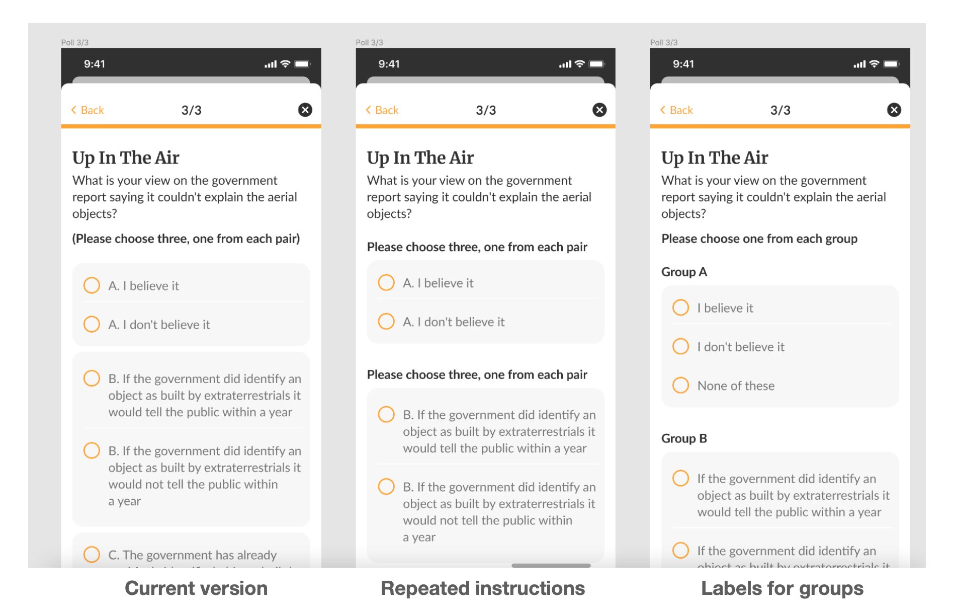
Grouped answer options accounting for feedback from testing
Handoff + Development
After the final designs were completed, we sent the master Figma file to the development team.
Upon delivery of the test version in Testflight, we used Confluence to collect and comment on issues during QA testing.
I worked with the founder to create a survey collecting feedback from users ten days after they became active on the app. We asked about their enjoyment, level of interest, and if they were using some of the new features. We wanted to know what was meaningful to the user, and what wasn’t.
I also analyzed the feedback that came through the feedback portal, as well as through respective store reviews.