An Informative + Clear Results Page
Final UI Design + Icons (2021) ☞
Problem:
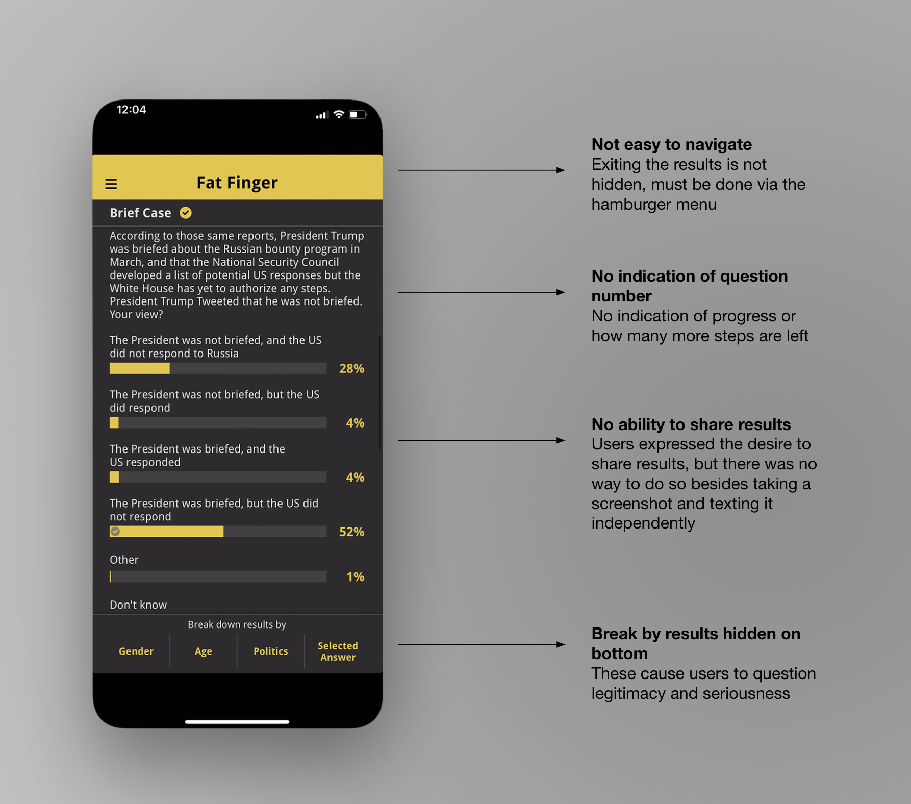
Users wanted more information about the results and general topic, and expressed wanting to share the results, but had no ability to do so. The visual design also made it difficult to skim and understand the results, and hid the breaking by demographics functionality.
Solution:
Create a space for extra information and related poll results to live, add a share feature, and update the visual design to make the results easier to understand.
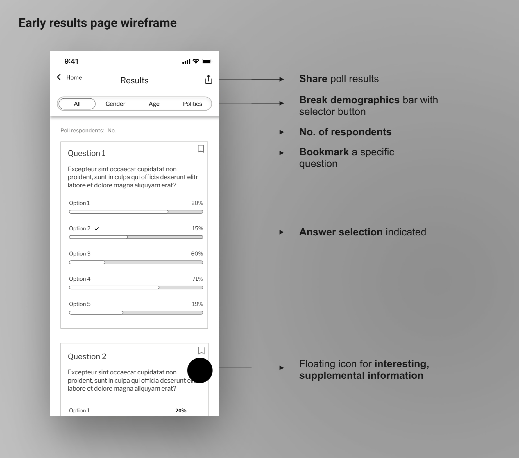
Users expressed in feedback and reviews that they wanted to share poll results, but had no ability to do so. They also brought up in feedback and store reviews that the results lacked context. While one could break the results by various demographics, the functionality was easily lost on the busy screen.
While viewing the results, there was not an obvious way to exit the page and navigate to a different area of the app.
Another pain point of the visual design besides the lack of space around elements was that different types of answers, such as groups of choices, were not visually presented as group, and lacked visual separation on the same page.
During discovery, I found that users said they liked the information from the results, and enjoyed seeing how they compared to others, as well as the ability to break the results by demographics.
We knew these were important features to highlight, and build upon.
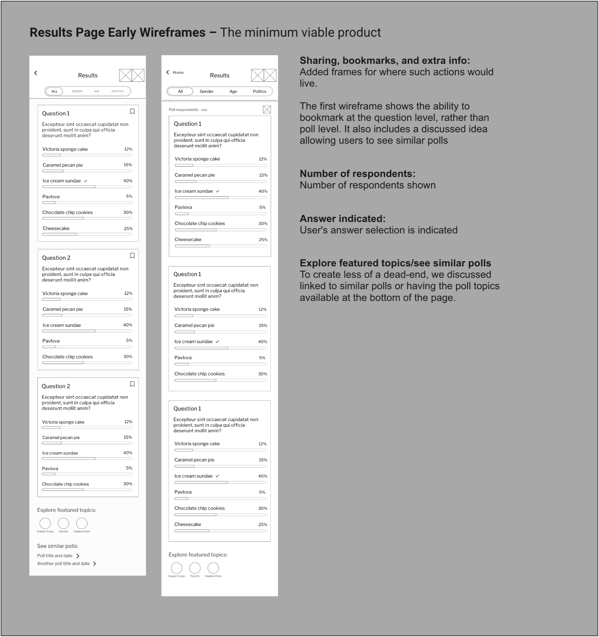
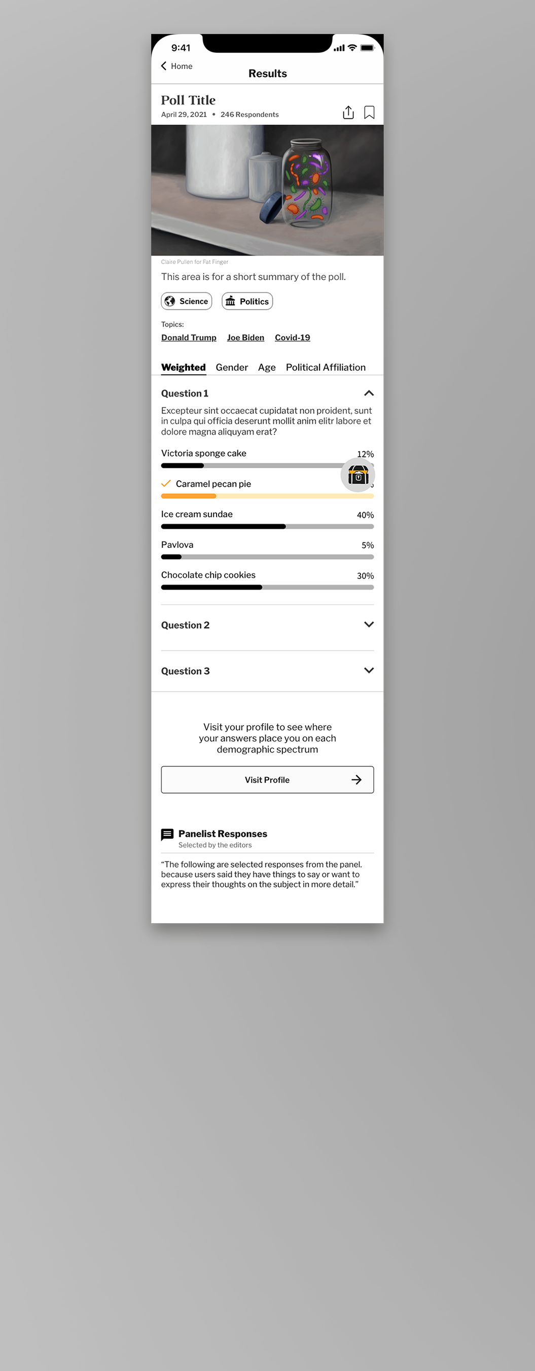
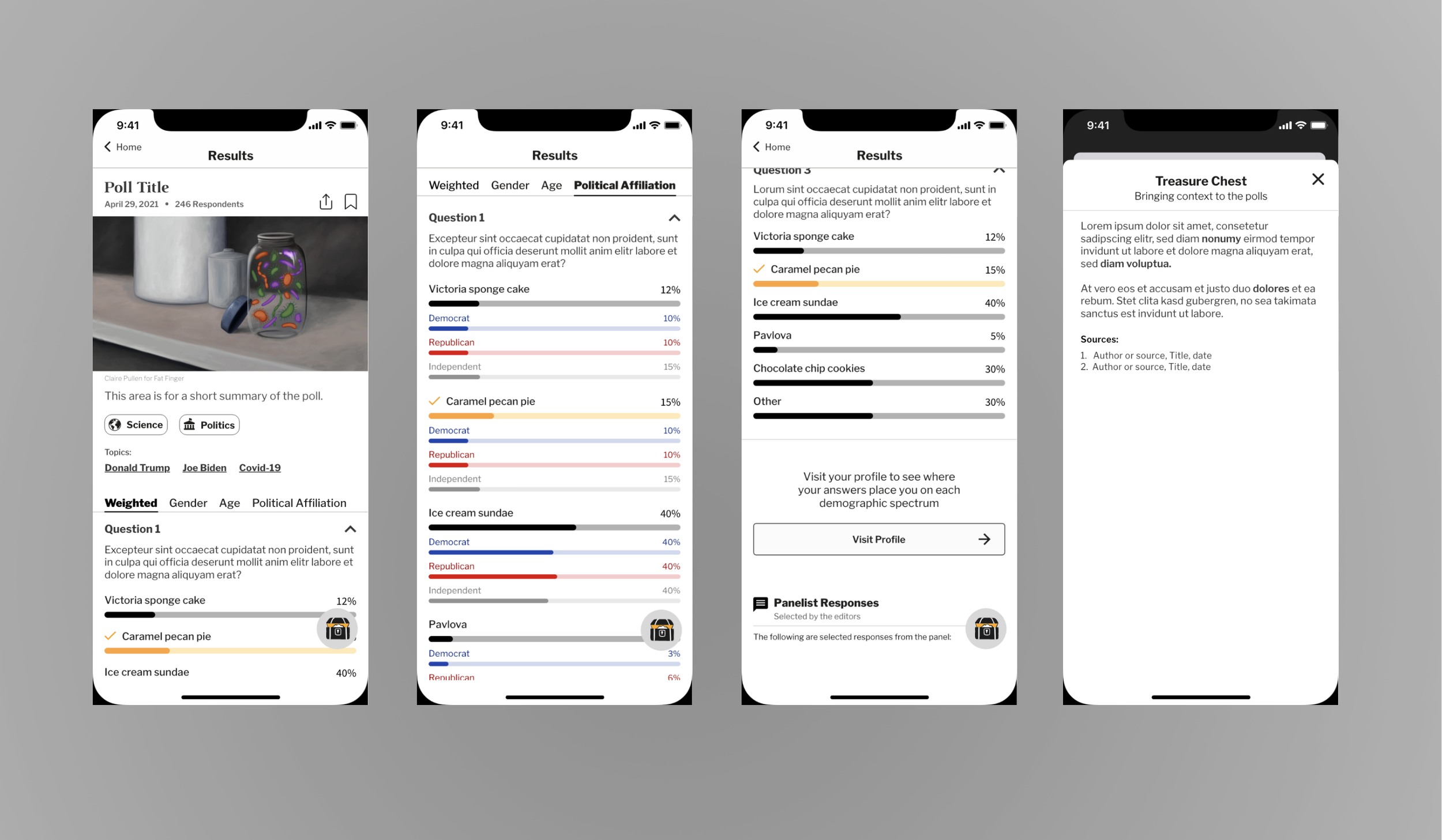
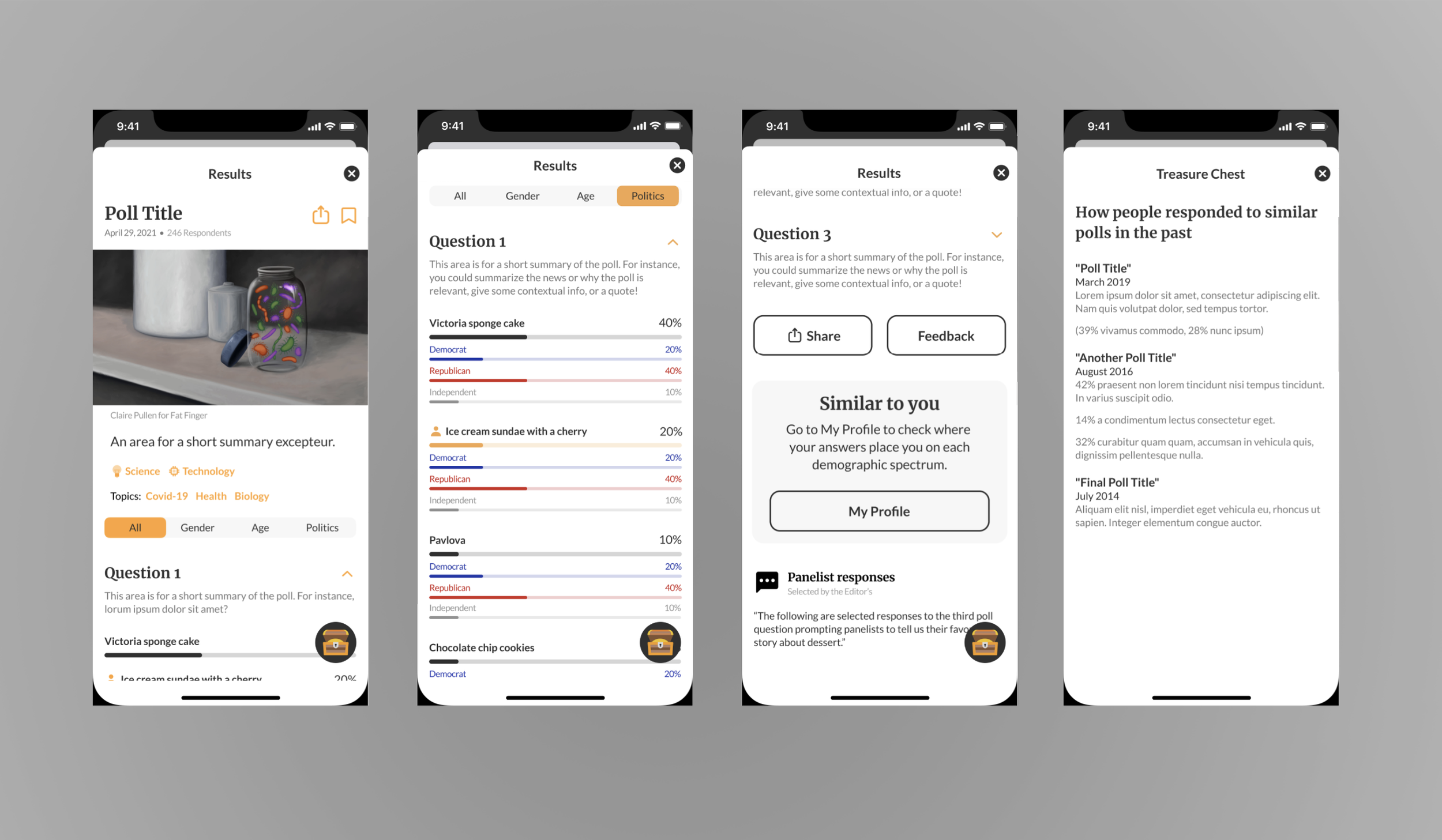
We first started with a minimum viable product: the poll results with the ability to break by demographics: gender, political affiliation, and age group.
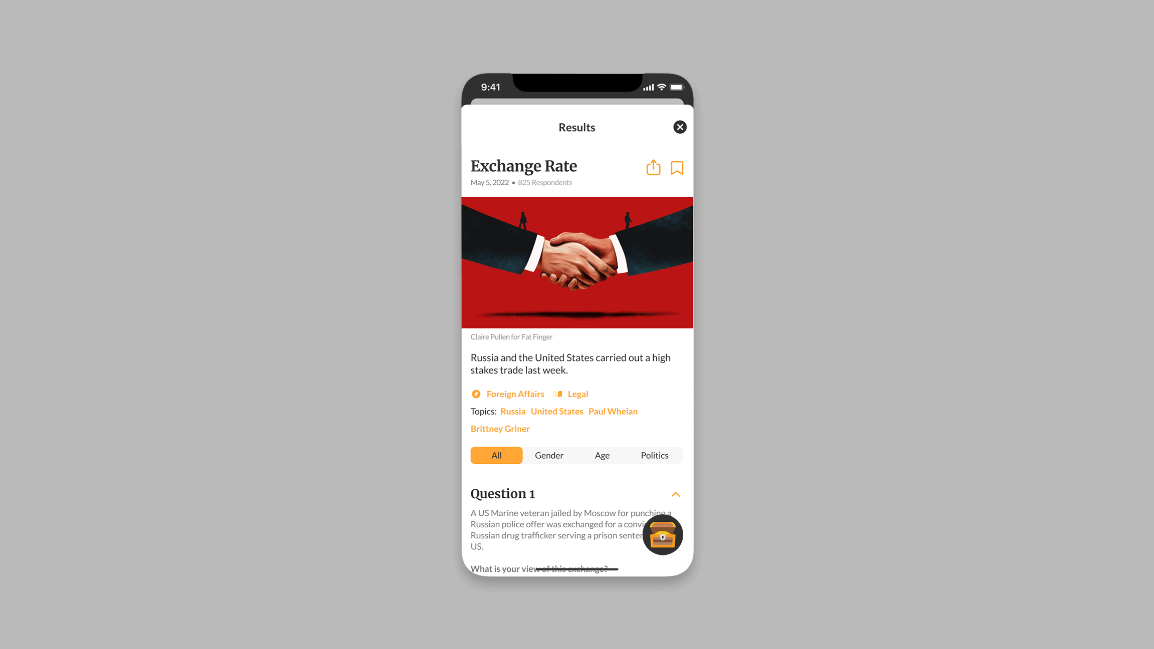
While brainstorming ways to include extra information, be it old poll data that was relevant to the topic, quotes from news articles, or general supplemental info that helped to inform the results, I came up with the idea of a "treasure chest" that to house this supplemental info and bring some fun to the discovery of such information.
We experimented with different ways of bringing this across in different iterations, from a small icon in the header to a floating button. Ultimately we decided on the floating button that stayed fixed on screen, as it differentiated itself from other actions such as sharing and bookmarking, and would be more noticeable to users.
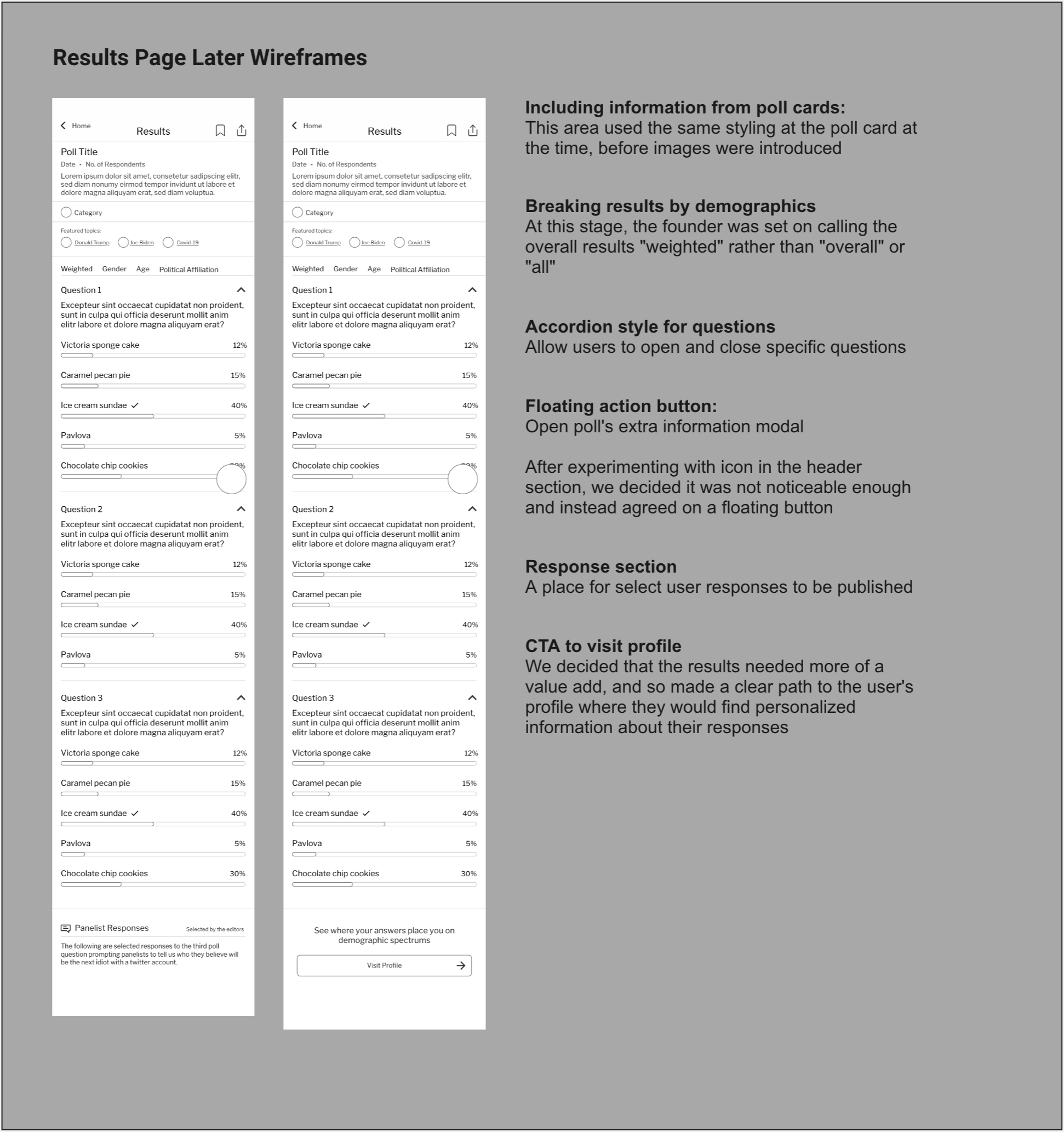
While collecting user feedback, I had taken note of a request for a comments section. This had been saved for a later iteration, and once we had the green light from development that the possibility could be an actuality, we moved forward with including it in the designs.
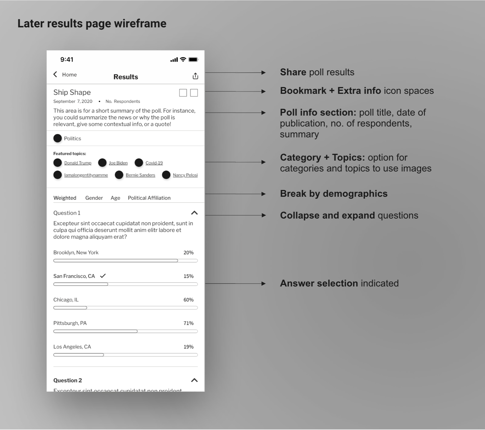
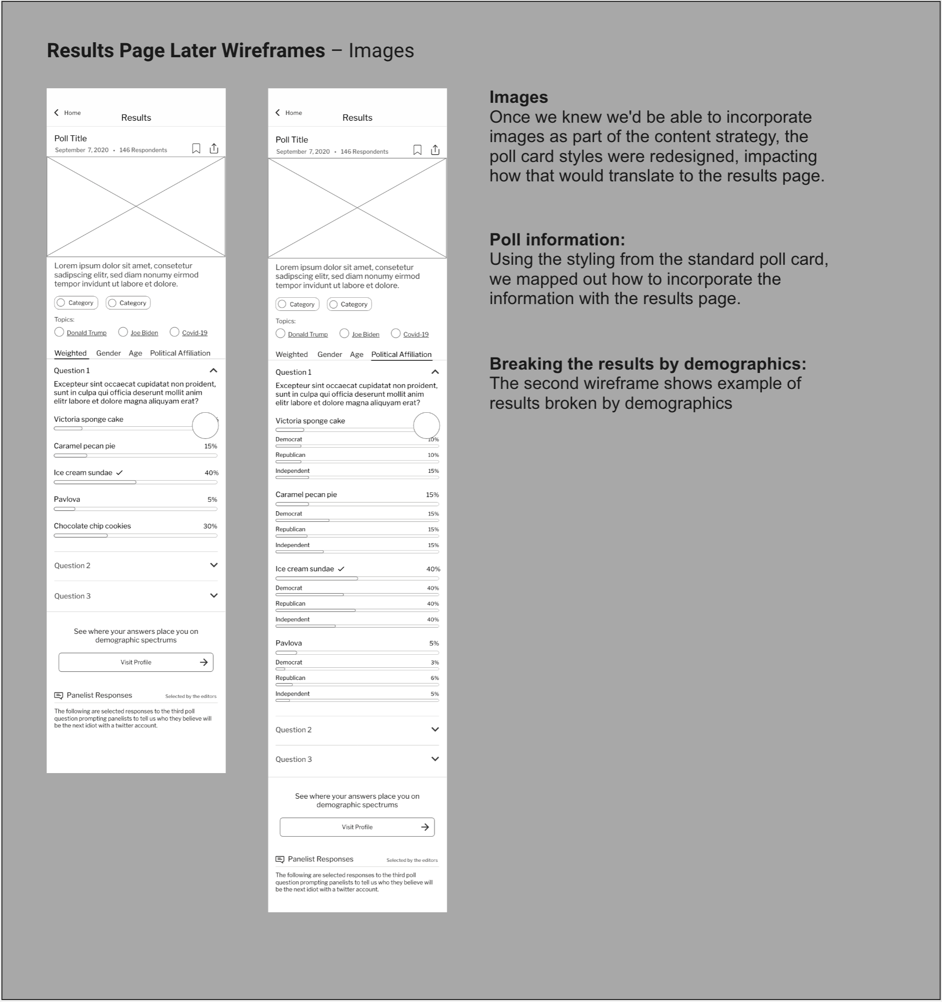
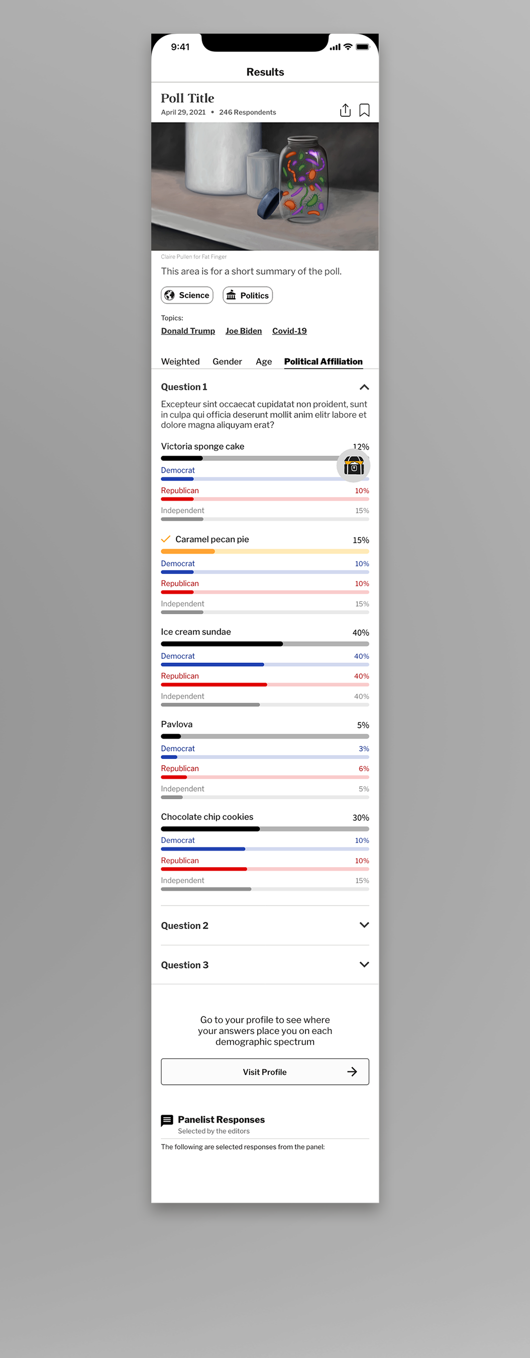
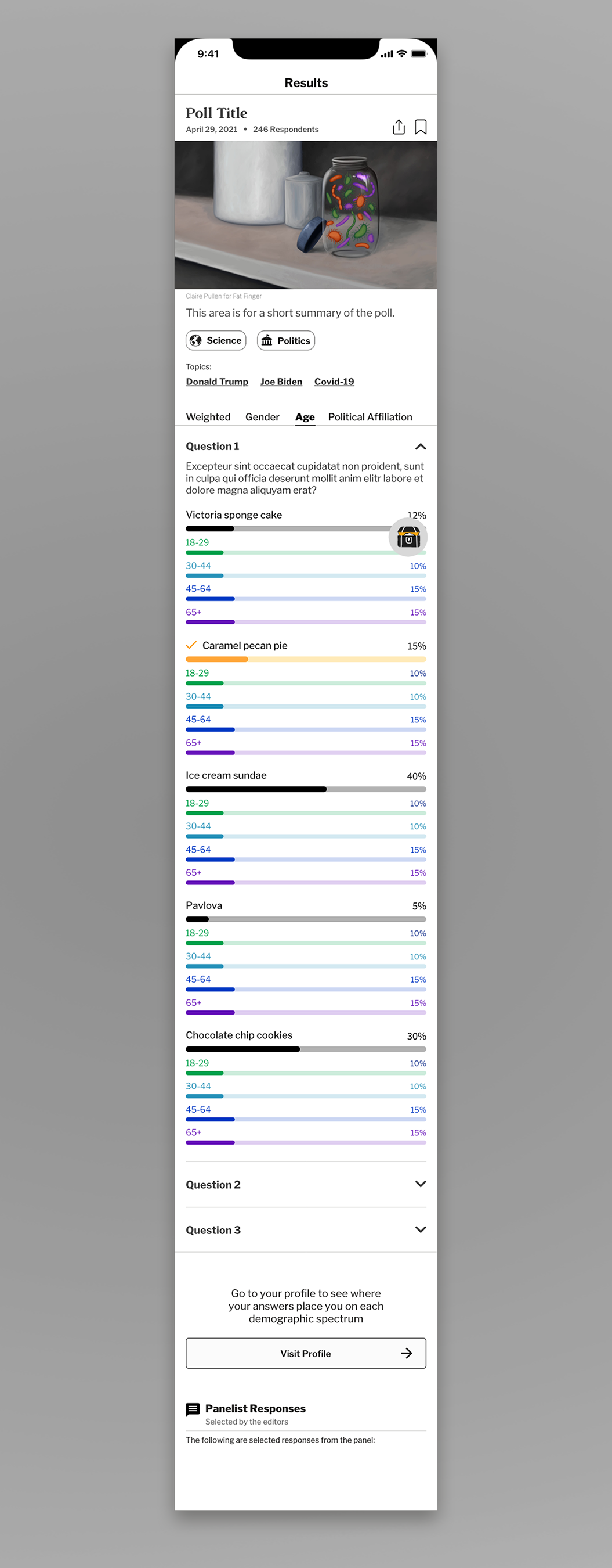
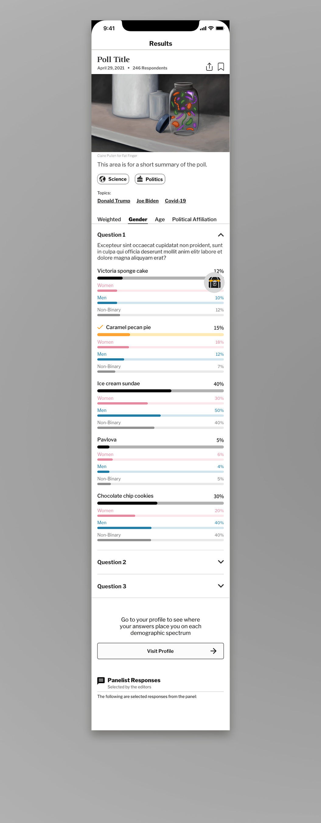
Breaking the results by demographics
Users enjoyed being able to break the results by different demographics to see how diverse groups felt on respective topics.
We wanted to make this experience more inclusive by adding a non-binary option to the gender portion of a user entering demographic information, and in turn added the option to the results breakdown.
We made sure that while a user scrolled, the bar with options to switch which demographic they were breaking by stuck to the top of the screen, remaining availble for use without the need to scroll.
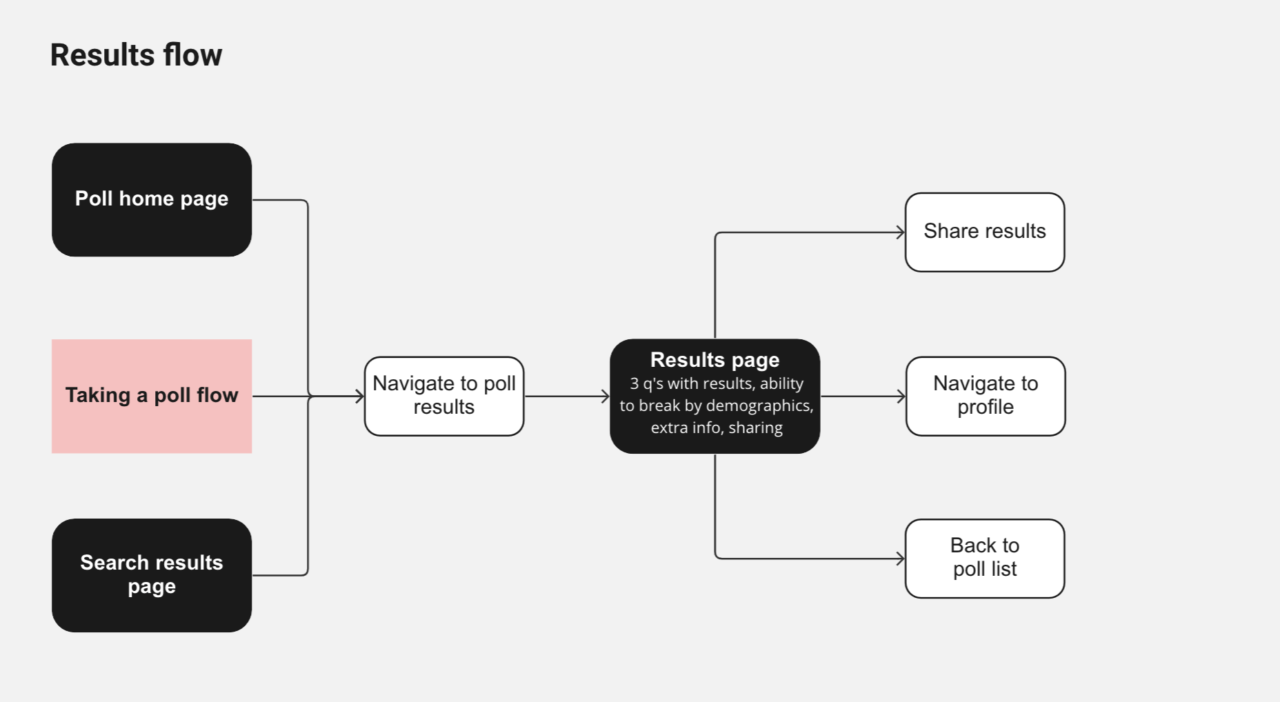
The final design changed the style of taking a poll and the results to modal screens rather than normal pages.
We also included three different calls to action at the bottom of the screen, giving users more direct and visual calls to share and give feedback; the visiting the profile button takes visual hierarchy.
Testing
Testers found the results screen to be crowded, so we increased the white space between elements and collapsed the summary to the first line, adding a "read more" interaction so that it didn't take up too much space.
Testers also didn't notice their answer selection, leading us to add a label saying "your answer" that would accompany the icon of a person next to the selected answer.
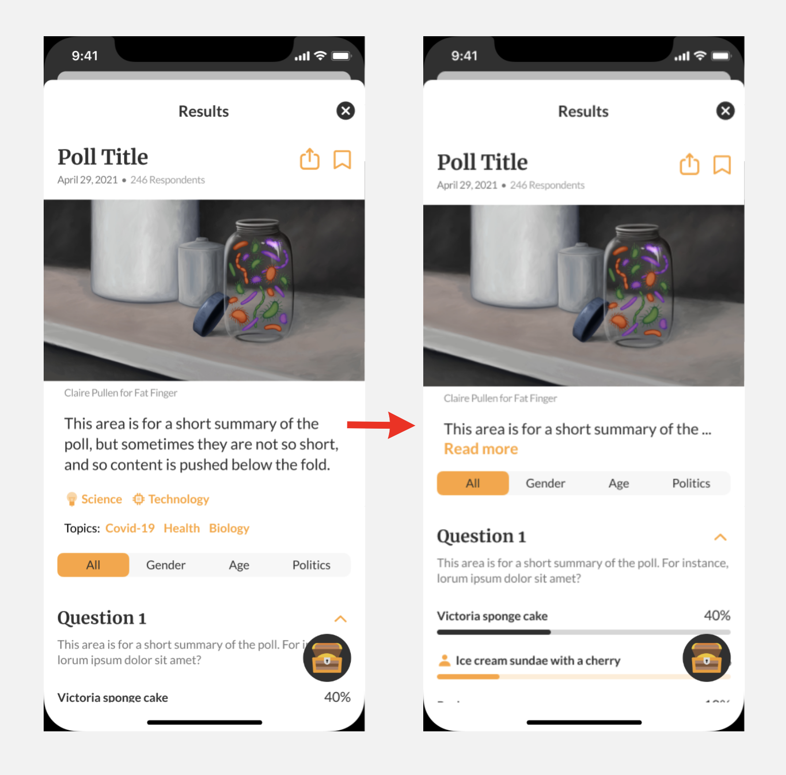
Adding a “read more” button to keep results above the fold
90 days after launching the latest iteration, which included the introduction of badges users could earn, we analyzed the data from said badges.
We discovered that the badge
awarded for
This insight
indicates that poll results represent a
We also conducted feedback surveys sent via email, in which
A user wrote us this feedback after the launch of the profile and attitudes section.